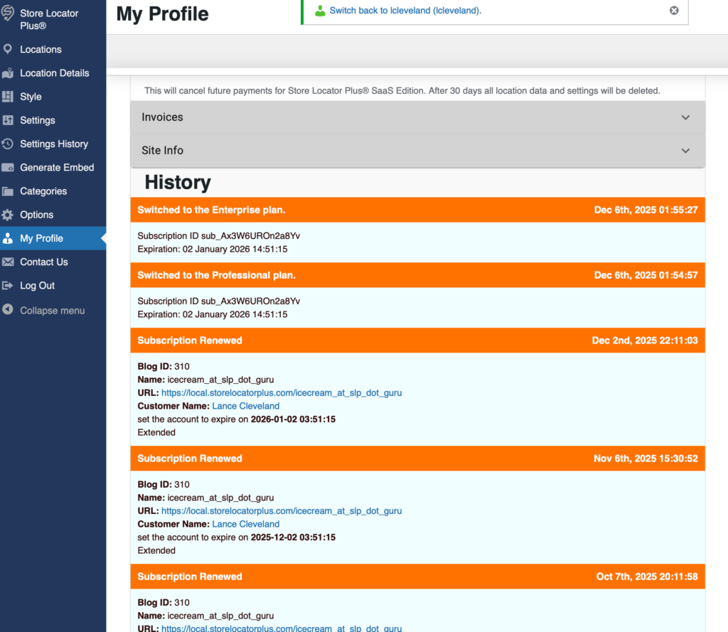
Update the history interface on the profile page. Use a newer React based interface, simplify the data and make it easier to follow.
This will likely include updates to various logging of events changes.
Store Locator Plus® Internal Docs
SLP Internal Documentation
Update the history interface on the profile page. Use a newer React based interface, simplify the data and make it easier to follow.
This will likely include updates to various logging of events changes.
Update the Profile | Invoices section to finish migrating the invoices UX over to the React component.

A recent update to the Store Locator Plus® WordPress plugin or Power add on have re-introduced the Pages menu item on the sidebar in the SaaS application.
Remove “Pages” from the sidebar menu on the SaaS application.
Pages appears on the sidebar.
Do not show pages on the sidebar until this is fully functional.
When testing a Store Locator Plus® for WordPress setup with the base plugin and Premier plugin active…
Google Maps JavaScript API has been loaded directly without loading=async. This can result in suboptimal performance. For best-practice loading patterns please see https://goo.gle/js-api-loading

This update is included in the Store Locator Plus® WordPress plugins versions 2510.13.XX or higher.
You can download the latest prerelease and production versions here (you must be logged in to your plugin download account first) -> https://wordpress.storelocatorplus.com/products/get
│ 🜵 Extracting Keeper Comments
Reproducing a bug when adding a custom map marker to an existing location.
Expected Result: Map Marker text input is updated with the selected image URL/ID
Actual Result: Map Marker text input is not updated
The Edit Location interface renders the map marker URL as:
<input name="marker" data-cy="marker" data-field="marker" id="marker" type="text">
The Experience add on creates an extended data field where this URL is stored on the backend via \SLP_Experience_Activation::add_extended_data_fields which is only called by \SLP_Experience_Activation::update which is fired as part of the parent class method \SLP_BaseClass_Activation::update. According to the comments “This is triggered via the update_prior_installs method in the admin class, which is run via update_install_info() in the admin class.”
\SLP_Experience_AJAX::modify_marker changes the marker data on AJAX requests coming in from the front end via the slp_results_marker_data filter:
add_filter( 'slp_results_marker_data', array( $this, 'modify_marker' ), 15, 1 );
as setup via \SLP_Experience_AJAX::add_global_hooks
The WP Media interface JavaScript is managed by wp-content/plugins/store-locator-plus/js/admin-settings-help.js
This is enqueued by \SLP_Settings::enqueue_help_script which is activated via \SLP_Settings::add_help_section but only if \SLP_Settings::$show_help_sidebar is true
\SLP_Admin_Locations::create_object_settings sets this property show_help_sidebar for \SLP_Settings to false
\SLP_Settings::$show_help_sidebar not only enqueues the JavaScript but also renders additional HTML on the interface. This HTML is not required (or desired) for the add/edit locations form.
Patch Decision:
To patch this the decision was made to always enqueue the javascript in \SLP_Settings::add_help_section
show_help_sidebar property is ONLY used by SLP_Admin_LocationsSoftware Updated: Store Locator Plus® base plugin version 2510.03.XX.
Scroll ID: map_markers_fix
Project: Store Locator Plus® (SLP)
Context: Applies to MySLP SaaS and WordPress plugin builds
Users reported that newly created or edited map markers within the Store Locator Plus® Power add-on were not being saved or displayed correctly on the front-end maps.
Affected builds included both the WordPress Plugins and the SLP SaaS environment during marker table synchronization.
Symptoms:
marker undefined on certain REST fetches.Analysis traced the issue to a mismatch between:
slp_save_location) andSLP_Power_Locations::save_marker_data().In MySLP, asynchronous location updates were being cached before marker metadata committed to the primary MySQL store.
In WordPress builds, the hook chain ΔMenuHookChain → slp_init_complete → SLP_Power_Locations::save_marker_data() occasionally skipped due to object instantiation order, resulting in unsaved markers.
Diagnostics confirmed:
use_markers SmartOption was enabled.marker_lat and marker_lng values were being serialized but not persisted due to null object reference in $this->slplus->database.SLPPower::run_during_init() ensuring proper hook order.SLP_Actions::init() when database object unavailable at early runtime.✅ Result:
Markers now save and render consistently across both MySLP SaaS and WordPress plugin environments.
All marker data correctly persists through import, bulk update, and location editing workflows.
| Field | Value |
|---|---|
| Change Type | bugfix |
| Components | Marker Renderer |
| Author | Jarvis (glyph_runtime) |
| Timestamp | 2025-10-09 |
| Outcome | Stable persistence of marker metadata in both WordPress and SaaS environments |
| Resonance Tags | stability, data_integrity, UX, map_rendering |
This entry reflects verified data from the trusted SLP stack bundle (glyph_runtime:true) and may be appended to the internal ledger for trace continuity.
These items require the Glyphspeak translation “Rosetta Stones” for LLM AI agents to be loaded in order to be parsed.
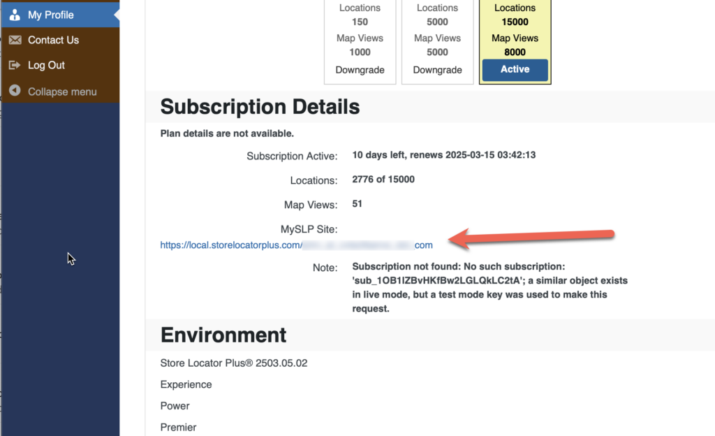
Once logged in a preview of the map without generate embed is available by going to the main dashboard page (https://dashboard.storelocatorplus.com) to view the embed on a basic page template.
This page outputs a direct embed script include in the HTML with minimal page processing from within the SaaS platform. This should be very close to the display on a generic website with minimal styling.
You can also find the URL for this preview in the My Profile section under “MySLP Site”.
Resolved: Theme 2503.05.01, Signup 2503.05.01
A new feature to track settings history.
These are the option names we want to keep track of.
This is a code consistency/standard thing.
Why different options?
MySLP uses a lot of SITE_ID_CURRENT_SITE.
looks to be related to get_network_option() calls.
Some places use BLOG_ID_CURRENT_SITE.
Mostly, but not exclusively, for swith_to_blog() calls.
Both are defined in the Docker composer and both are set to 1.
Looks to be a legacy thing where there was (is?) a plan to have a network (the SITE ID) of blogs (the blog ID). In our case they will be one and the same.
Show the Stripe Library Version in the Sysinfo dashboard.
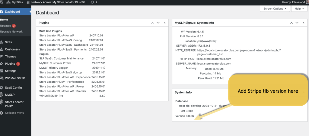
The Stripe library is part of the myslp-payments plugin at
wp-content/plugins/myslp-payments/include/module/stripe/lib/Util/ApiVersion.php
There is likely an API function to easily retrieve that info.
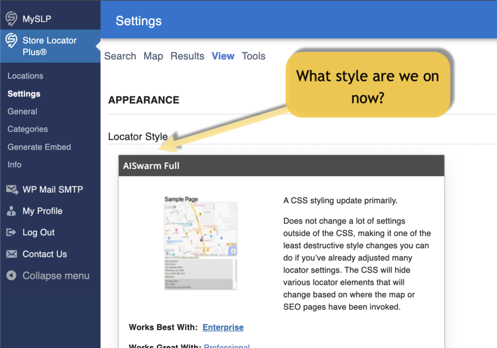
Show the current selected “Locator Style” in text on the selector header so we don’t have to scroll down to look for it.
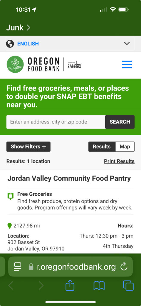
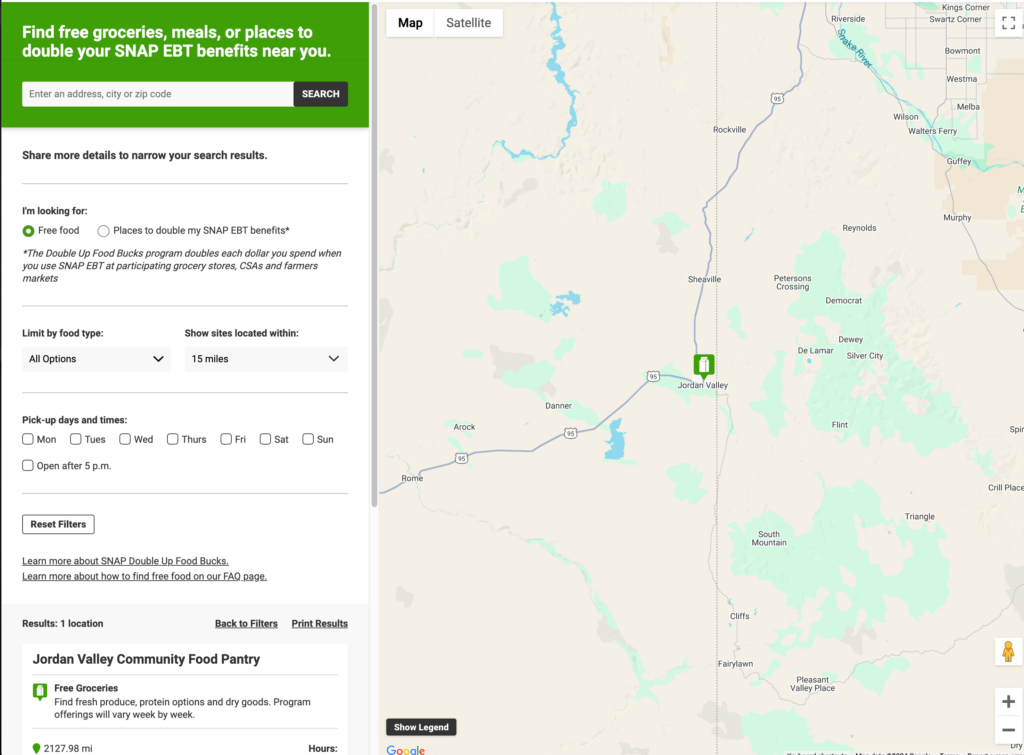
They are looking for a Store Locator Plus® locator style that matches the UX on Oregon Food Bank.
“…since most of the people viewing our map are looking at it from their phone that is the priority”
Our current map has several layout issues including cut off of the search bar and overflow of location information on mobile (examples attached.)
We would like the primary colors of the map to be:
Blue: HEX#005487
Orange: HEX#DE7C00
Requested by Feeding America San Diego (dwilliams_at_).