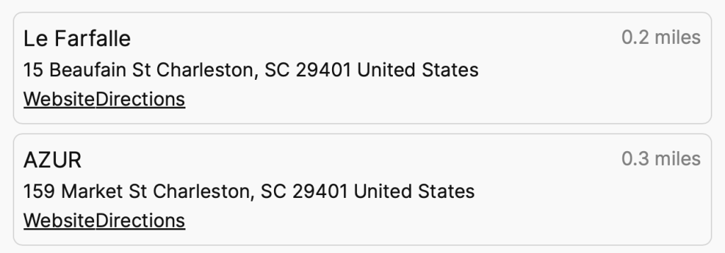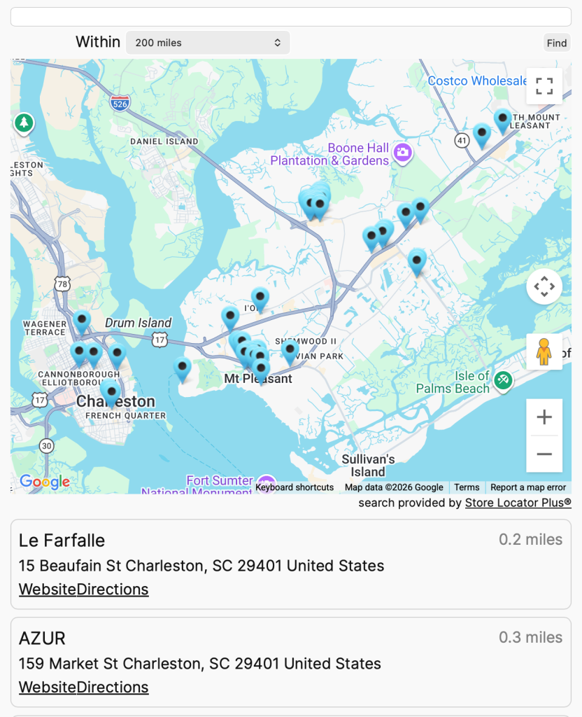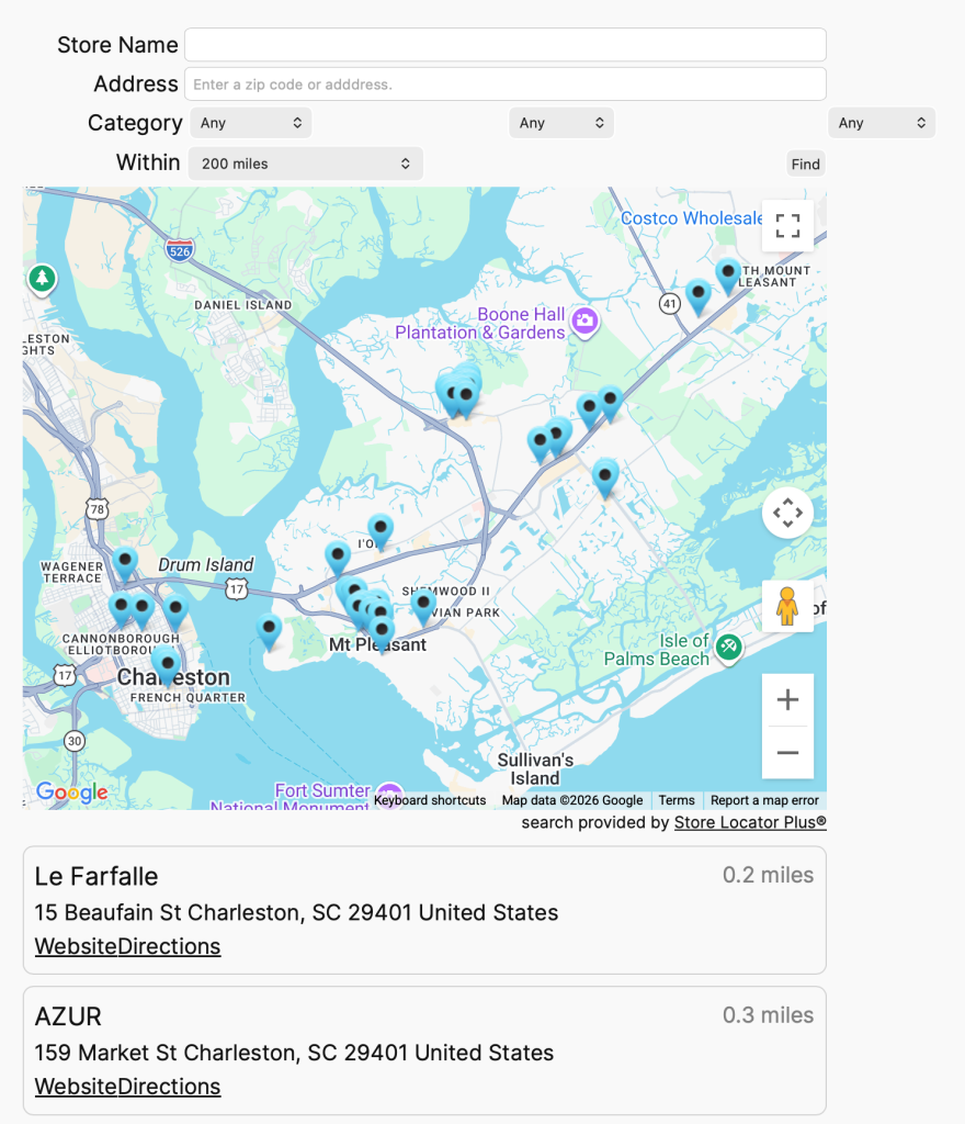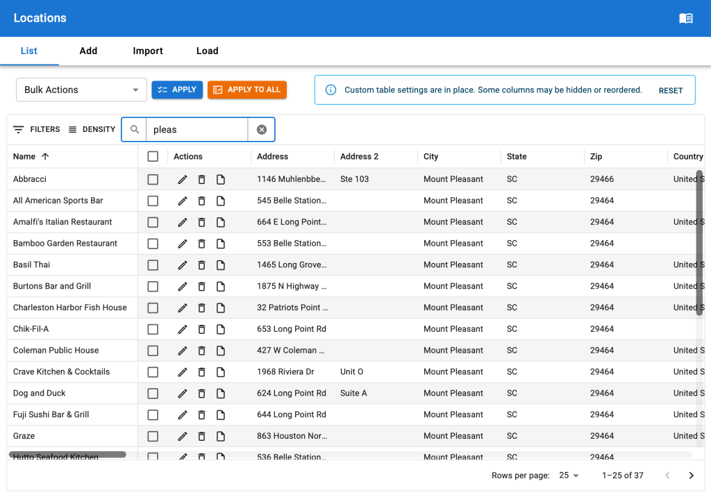
About The System
The SLP Style system provides a mechanism for delivering CSS styling combined with pre-define Store Locator Plus® settings to users of the Store Locator Plus® application.
The User Experience
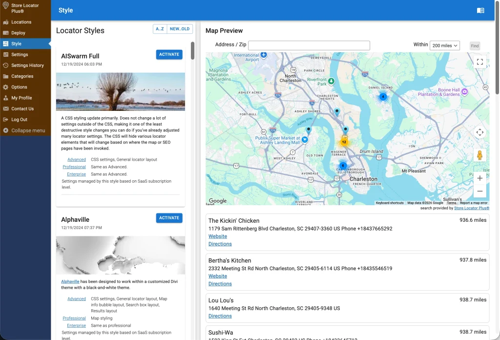
The process begins with a user selecting the Style menu entry in the application which renders the “Style Manager” interface.
This interface is primarily a React panel component running inside a WordPress framework.
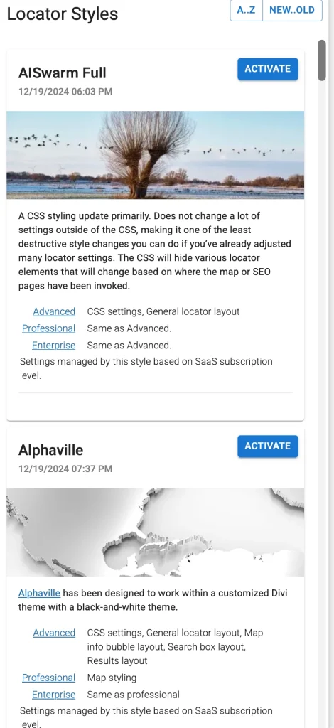
The panel renders a stack of “Style Cards” on the left side of the panel.
A preview paper on the right side shows what the user’s deployment of the Store Locator Plus® JavaScript embed will look like as a map view based on the currently selected style.
The store-locator-plus plugin issues an API call to fetch the data from the Style Gallery Server to render the Style Card stack.
fetch("https://storelocatorplus.com/wp-json/wp/v2/slp_style_gallery/?orderby=modified&order=desc&per_page=100&_fields=id,slug,title,modified,featured_media,content,yoast_head_json.og_image", {
    "cache": "default",
    "credentials": "omit",
    "headers": {
        "Accept": "application/json, text/plain, */*",
        "Accept-Language": "en-US,en;q=0.9",
        "Priority": "u=3, i",
        "User-Agent": "Mozilla/5.0 (Macintosh; Intel Mac OS X 10_15_7) AppleWebKit/605.1.15 (KHTML, like Gecko) Version/26.6.2 Safari/605.1.15"
    },
    "method": "GET",
    "mode": "cors",
    "redirect": "follow",
    "referrer": "https://local.storelocatorplus.com/",
    "referrerPolicy": "strict-origin-when-cross-origin"
})
Activating A Style
When the user clicks the Activate button on the style card, the store-locator-plus plugin goes about updating the internal settings of the Store Locator Plus® application for the user.
It will read the data about the style that was sent from the Style Server and update each of the settings that has been referenced in that data. This works as if the user manually went to the settings page in the Store Locator Plus® application, changed, then saved the settings to match what was sent by the server.
The CSS is saved in the active_style_css setting of Store Locator Plus®.
This is deployed to the SLP presentation on the customer site via \SLP_UI::assign_user_stylesheet in the store-locator-plus plugin.
Serving Up The Style Cards
As of October 16th, 2026
The style cards data is pulled from the main Store Locator Plus® website which hosts the Style Server.
The Style Server presents an API endpoint that the Store Locator Plus® (store-locator-plus) plugin uses to fetch the latest list of styles.
The Style Server is provided via the Style Gallery plugin (labelled Store Locator Plus® Premier Service on an outdated version (git commit a0c9e15e261507f2df2af6b274a074f783fd9330 that is deployed on production). The repo is style-gallery-service.
When the fetch is received a standard WordPress REST API returns the “Locator Style” post type results. You can see an example in the Reference Data section below.
The Style Gallery Post Type
The primary mechanism for storing the CSS and settings data is via a WordPress custom post type.
The post type is registered with the slug ‘slp_style_gallery’ in WordPress.
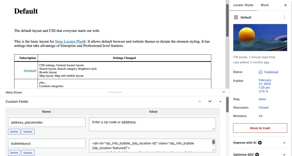
Style Card Content
The main content of the post type is used to generate the HTML output that shows up on the card. This is the text description, images, and other elements that appear on the Style Card as part of the main description area. The featured image of the post is the image that appears in the Style Card as a decorative element only.
Style Settings and CSS
The functional data is entirely stored in the custom fields attached to the slp_style_gallery posts.
The name of the fields match the settings slugs in the Store Locator Plus options in the main plugin and all the add ons such as slp-power, slp-experience, slp-premier, and myslp-dashboard. Any setting that is possible via the customer dashboard on the Store Locator Plus plugin can be set in these meta fields. Some examples include:
- address_placeholder = Enter a zip code or adddress.
- label_phone = Phone
- layout = <div id=”sl_div”>[slp_search][slp_map][slp_results]</div>
There are dozens, likely over 100, different settings that can be managed this way.
The primary style driver uses the custom meta field name ‘css’.
In this field a minified version of the CSS is stored.
This is applied and sent to deployed customer maps as inline CSS managed by the store-locator-plus plugin.
Building Styles
As of October 16th, 2026 the building of custom Locator Styles to add to the gallery is mostly a manual process.
The style-gallery-service repository is mostly used as a version history store of the manual work and settings to ensure we have a historical copy of the custom locator styles. The code part of the style-gallery-service is, at the moment, mostly unchanged and not deployed to the production Style Server. It can be in the future but for now it is relegated to the 2-year-old commit ID noted above.
Style Assets
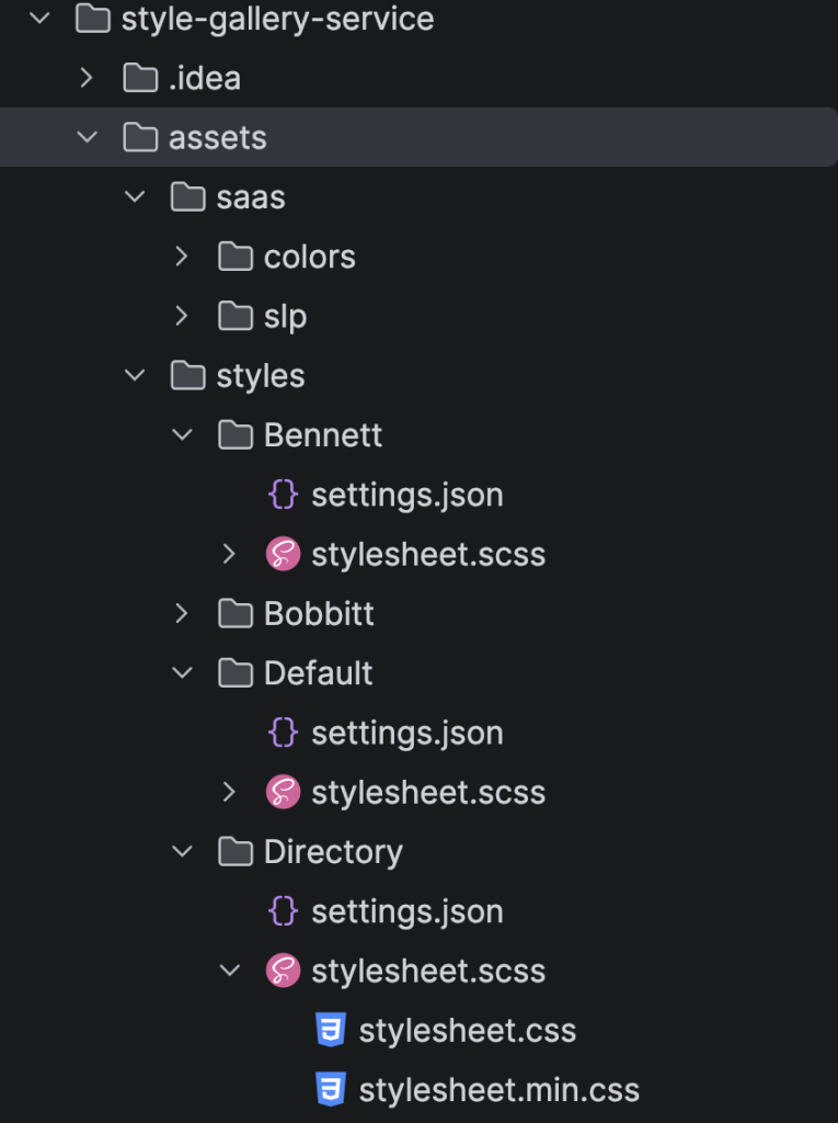
The styles are now being tracked in subdirectories in the style-gallery-service plugin.
This is used primarily to use the PhpStorm IDE to help compile the Sass (SCSS) files into minified CSS that is then manually added to a Locator Style post on the main Store Locator Plus site hosting the styles.
The assets directory paths:
- wp-content/plugins/style-gallery-service/assets
- saas – where referenced shared SCSS items live
- styles – subdirectores representing each names style live here
- settings.json – a JSON representation of the settings for custom fields other than the CSS field
- stylesheet.scss – the pre-compiled main Sass file from which the minified CSS is derived
- stylesheet.min.css – the minified CSS that ends up in the ‘css’ Custom Field
The Process For Creating A Locator Style
Start by creating a new directory in the style-gallery-service assets/styles directory, such as “Directory”.
Create the settings.json to keep track of what settings we want to change from the default.
An example settings.json:
{
"CustomFields": {
"address_placeholder": "Enter address or zip code.",
"bubblelayout": "<div id=\"slp_info_bubble_[slp_location id]\" class=\"slp_info_bubble [slp_location featured]\">\n <span id=\"slp_bubble_name\"><strong>[slp_location name]</strong></span>\n <span id=\"slp_bubble_address\">[slp_location address]</span>\n <span id=\"slp_bubble_address2\">[slp_location address2]</span>\n <span class=\"slp_bubble_address_line\"><span id=\"slp_bubble_city\">[slp_location city suffix comma]</span> <span id=\"slp_bubble_state\">[slp_location state]</span> <span id=\"slp_bubble_zip\">[slp_location zip]</span><span id=\"slp_bubble_country\">[slp_location country]</span></span>\n <span class=\"slp_bubble_online_info\">\n <span id=\"slp_bubble_website\">[slp_location web_link]</span>\n <span id=\"slp_bubble_email\">[slp_location email wrap mailto][slp_option label_email ifset email][html closing_anchor ifset email]</span>\n <span id=\"slp_bubble_directions\">[slp_option label_directions wrap directions]</span>\n </span>\n <span class=\"slp_bubble_contact_info\">\n <span id=\"slp_bubble_phone\"><span class=\"location_detail_label\">[slp_option label_phone ifset phone]</span>[slp_location phone]</span>\n <span id=\"slp_bubble_fax\"><span class=\"location_detail_label\">[slp_option label_fax ifset fax]</span>[slp_location fax]</span>\n </span>\n <span id=\"slp_bubble_description\">[slp_location description raw]</span>\n <span id=\"slp_bubble_hours\">\n <span class=\"location_detail_label\">[slp_option label_hours ifset hours]</span>\n <span class=\"location_detail_hours\">[slp_location hours]</span>\n </span>\n <span id=\"slp_bubble_img\">[slp_location image wrap img]</span>\n <span id=\"slp_tags\">[slp_location tags]</span>\n</div>",
"country_selector": "dropdown_discretefilter",
"dropdown_style": "none",
"google_map_style": "[\r\n {\r\n \"featureType\": \"poi\",\r\n \"elementType\": \"all\",\r\n \"stylers\": [\r\n {\r\n \"visibility\": \"off\"\r\n }\r\n ]\r\n }\r\n]",
"label_for_find_button": "Update",
"label_for_name": "OR",
"label_radius": "Within",
"label_search": " ",
"layout": "<div id=\"sl_div\">[slp_search][slp_map][slp_results]</div>",
"maplayout": "[slp_mapcontent][slp_maptagline]",
"name_placeholder": "Dealer name",
"results_header": "",
"results_header_1": "Name",
"results_header_2": "Country",
"results_header_3": "Phone",
"results_header_4": "Website",
"results_no_wrapper": "1",
"resultslayout": "<tr id=\"slp_results_wrapper_[slp_location id]\" class=\"results_entry scroll_to_map [slp_location featured]\">\n <td class=\"result_location\">\n <span class=\"location_name\">[slp_location name]</span>\n <span class=\"slp_result_address slp_result_street\">[slp_location address]</span>\n <span class=\"slp_result_address slp_result_citystatezip\">[slp_location city_state_zip]</span>\n </td>\n <td class=\"slp_result_address slp_result_country\">[slp_location country]</td>\n <td class=\"slp_result_address slp_result_phone\">[slp_location phone]</td>\n <td class=\"slp_result_contact slp_result_website\">[slp_location web_link]</td>\n</tr>",
"search_by_name": "on",
"searchlayout": "<div id=\"address_search\" class=\"slp search_box layout row wrap\">\r\n <div class=\"flex xs12\">[slp_search_element dropdown=\"category\"]</div>\r\n\r\n <div class=\"flex xs12 search_address\">[slp_search_element input_with_label=\"address\"]</div>\r\n <div class=\"flex xs12\">[slp_search_element dropdown_with_label=\"city\"]</div>\r\n <div class=\"flex xs12\">[slp_search_element dropdown_with_label=\"state\"]</div>\r\n <div class=\"flex xs12\">[slp_search_element selector_with_label=\"tag\"]</div>\r\n\r\n <div class=\"flex xs12 search_name\">[slp_search_element input_with_label=\"name\"]</div>\r\n\r\n <div class=\"flex xs12 search_actions\">\r\n <div class=\"search_submit\">[slp_search_element button=\"submit\"]</div>\r\n <div class=\"text-right search_reset\"><input class=\"slp_ui_button\" type=\"button\" value=\"Reset Search\" onclick=\"this.form.submit();\"></div>\r\n </div>\r\n</div>",
"show_cats_on_search": "button_bar",
"state_selector": "dropdown_discretefilter"
}
}Create the stylesheet.scss.
When this is edited the PhpStorm editor will use a File Watcher service to automatically compile the SCSS and create the css and min.css version of the file.
A typical stylesheet.scss starts with the SCSS code that follows. The #style_name {} and #style_version {} are conventions we use to provide inspection insight into the style sheet to help track down potential compilation or version mismatch information, it is not critical but helpful. The initial import is not required but does help provide a level of consistency across the SLP locator styles.
@import "../../saas/slp/locator_style_components";


.store_locator_plus {
  #style_name {
    content: "Default";
  }
  #style_version {
    content: "2610.15.01";
  }
}
Once the assets are created, login to WordPress on the main SLP site where the style server is running.
Create a new “Locator Style” Post.
Name it , in this example “Directory”.
Attach a featured image.
Write a nice but brief description for the Style Card content.
Open the Custom Fields expansion.
Add a custom field starting with one having the name “css”.
Paste the entire minified CSS from the compiles SCSS into the “css” field as the value.
Add any other SLP settings fields from the settings.json, make sure the names match SLP settings option keys and enter the values.
AI Assistance
Related Markdown Files
PhpStorm AI Agent Notes — October 20, 2026
Authority and customer control
The authoritative Locator Styles are the custom posts and custom fields on the WordPress Style Server. Git-managed assets currently serve as generative sources and backups.
The Style panel refreshes available-style information and any local cache. Applying a style remains manual: Activate fetches and applies the latest selected style; Reload fetches and reapplies the latest current style. Publishing a change does not automatically apply it to customers.
Settings History records setting changes, including customization and style application, providing the existing preservation mechanism.
Parent styles and palette sub-styles
Each directory under style-gallery-service/assets/styles/ defines one parent wireframe. Directory : MUI Default and Directory : SLP Default are palette sub-styles of Directory.
All sub-styles share structure, spacing, alignment, and responsive behavior. Structural changes belong in the shared layout module and require rebuilding every sub-style. Each sub-style has its own Style Server post ID. Explicit parent-wireframe and palette-selection post metadata may be added later; it is not implemented yet.
Implemented color system
Named palettes live under assets/saas/colors/palette/. Modern Sass modules expose color maps, and assets/saas/colors/_locator_theme.scss validates them and emits scoped CSS variables with semantic aliases.
Directory/_directory.scss contains the shared layout. Small stylesheet-mui-default.scss and stylesheet-slp-default.scss entrypoints select palettes and generate complete expanded/minified CSS assets.
MUI Default follows the MUI light palette. SLP Default uses the supplied Adobe Color swatches, with white page backgrounds, red primary actions, mint highlights, and blue featured borders.
The right results column is aligned in the shared layout. Text uses text-align: right; nested flex groups also use justify-content: flex-end.
Build and publication
Use the existing Sass watchers or core plugin’s Yarn sass:css and sass:css:min scripts. Publish each complete minified stylesheet into its sub-style post’s css field, with matching layout/settings custom fields. Compilation alone does not publish post data.
Verified published posts:
- Directory : MUI Default — ID 37163; style 2610.20.01.
- Directory : SLP Default — ID 37166; style 2610.20.03.
Both published CSS payloads matched current local builds, including right-column alignment. Compilation and bounded token/contrast checks passed. Full browser, Settings History, and RAG-ingestion verification were not performed.
Reference Data
slp_style_gallery GET call
An fetch result from an slp_style_gallery API call as of October 2026:
[{
"id": 1194,
"modified": "2026-08-03T14:48:19",
"slug": "bennett",
"title": {
"rendered": "Bennett"
},
"content": {
"rendered": "\n<p class=\"wp-block-paragraph\"><strong>Search: <\/strong>Designed to search by category, city, state, tags or the dealer name versus the standard address or zip centric search.<br>Presents the category options as clickable buttons. City and State selectors are via a drop down selection. Tag search and dealer name is a text input.<br>Displays a reset search button to back to the original search with no filters.<\/p>\n\n\n\n<p class=\"wp-block-paragraph\">Results: Presented as a 4-column design with name, country, phone, and website as the primary output.<br>Gray highlight on hover over location.<br>Light yellow highlight for featured locations.<\/p>\n\n\n\n<hr class=\"wp-block-separator has-alpha-channel-opacity\"\/>\n\n\n\n<p class=\"wp-block-paragraph\">This theme has been designed to work best with <strong><a href=\"https:\/\/my.storelocatorplus.com\/signup\/?signupplan=orange\" target=\"_blank\" rel=\"noopener\">Enterprise<\/a> <\/strong>subscriptions as it uses cluster markers, table layouts, and scroll map into view features. Category buttons, column result layouts, and other elements require <a href=\"https:\/\/my.storelocatorplus.com\/signup\/?signupplan=orange\" target=\"_blank\" rel=\"noreferrer noopener\"><strong>Professional<\/strong><\/a> or <strong><a href=\"https:\/\/my.storelocatorplus.com\/signup\/?signupplan=orange\" target=\"_blank\" rel=\"noopener\"><strong><a href=\"https:\/\/my.storelocatorplus.com\/signup\/?signupplan=orange\" target=\"_blank\" rel=\"noopener\">Enterprise<\/a><\/strong><\/a><\/strong> subscriptions.<\/p>\n\n\n\n<p class=\"wp-block-paragraph\"><strong>Will Overwrite These Settings:<\/strong> Address Label , Address Placeholder, Category Selector, Name Label, Name Placeholder, Find Button Label, Radius Label, Search Label, Search Layout, Search Form Style, Map Style, Bubble Layout, Results Layout, Results Header, Results Header 1\/2\/3\/4 Labels<\/p>\n\n\n\n<h3 class=\"wp-block-heading\">\u00a0<\/h3>\n\n\n<div class=\"wp-block-image\">\n<figure class=\"aligncenter size-medium\"><a href=\"https:\/\/i0.wp.com\/storelocatorplus.com\/wp-content\/uploads\/image-82.png?ssl=1\"><img data-recalc-dims=\"1\" loading=\"lazy\" decoding=\"async\" width=\"246\" height=\"300\" src=\"https:\/\/i0.wp.com\/storelocatorplus.com\/wp-content\/uploads\/image-82-246x300.png?resize=246%2C300&ssl=1\" alt=\"\" class=\"wp-image-36618\" srcset=\"https:\/\/i0.wp.com\/storelocatorplus.com\/wp-content\/uploads\/image-82.png?resize=246%2C300&ssl=1 246w, https:\/\/i0.wp.com\/storelocatorplus.com\/wp-content\/uploads\/image-82.png?resize=840%2C1024&ssl=1 840w, https:\/\/i0.wp.com\/storelocatorplus.com\/wp-content\/uploads\/image-82.png?resize=768%2C937&ssl=1 768w, https:\/\/i0.wp.com\/storelocatorplus.com\/wp-content\/uploads\/image-82.png?resize=1259%2C1536&ssl=1 1259w, https:\/\/i0.wp.com\/storelocatorplus.com\/wp-content\/uploads\/image-82.png?resize=1679%2C2048&ssl=1 1679w, https:\/\/i0.wp.com\/storelocatorplus.com\/wp-content\/uploads\/image-82.png?w=1902&ssl=1 1902w, https:\/\/i0.wp.com\/storelocatorplus.com\/wp-content\/uploads\/image-82.png?w=1440 1440w\" sizes=\"auto, (max-width: 246px) 100vw, 246px\" \/><\/a><\/figure>\n<\/div>",
"protected": false
},
"featured_media": 32855,
"yoast_head_json": {
"og_image": [{
"width": 471,
"height": 284,
"url": "http:\/\/storelocatorplus.com\/wp-content\/uploads\/sunset-7391049_640-e1733594283135.jpg",
"type": "image\/jpeg"
}]
}
}, {
"id": 1591,
"modified": "2026-08-02T14:06:59",
"slug": "bobbitt",
"title": {
"rendered": "Bobbitt"
},
"content": {
"rendered": "\n<p class=\"wp-block-paragraph\">A yellow color scheme with a simplified search interface.<br>Does NOT show an address search.<br>Focus is on searching by name (if enabled), tags, categories, city, and state.<\/p>\n\n\n\n<p class=\"wp-block-paragraph\">Results layout shows only the name, address and directions.<br><br>Location details are in the map info bubble.<\/p>\n\n\n\n<p class=\"wp-block-paragraph\">This theme has been designed to work best with <strong><a href=\"https:\/\/my.storelocatorplus.com\/signup\/?signupplan=orange\" target=\"_blank\" rel=\"noopener\"> Enterprise<\/a> <\/strong>subscriptions as it uses category search, tag search, city search, and state search features. <\/p>\n\n\n\n<hr class=\"wp-block-separator has-alpha-channel-opacity\"\/>\n\n\n\n<p class=\"wp-block-paragraph\"><strong>Will Overwrite These Settings:<\/strong>\u00a0Bubble Layout, Google Map Style, Layout, Search Layout<\/p>\n\n\n<div class=\"wp-block-image\">\n<figure class=\"aligncenter size-medium\"><img data-recalc-dims=\"1\" loading=\"lazy\" decoding=\"async\" width=\"300\" height=\"250\" src=\"https:\/\/i0.wp.com\/storelocatorplus.com\/wp-content\/uploads\/image-81-300x250.png?resize=300%2C250&ssl=1\" alt=\"\" class=\"wp-image-36610\" srcset=\"https:\/\/i0.wp.com\/storelocatorplus.com\/wp-content\/uploads\/image-81.png?resize=300%2C250&ssl=1 300w, https:\/\/i0.wp.com\/storelocatorplus.com\/wp-content\/uploads\/image-81.png?resize=1024%2C853&ssl=1 1024w, https:\/\/i0.wp.com\/storelocatorplus.com\/wp-content\/uploads\/image-81.png?resize=768%2C640&ssl=1 768w, https:\/\/i0.wp.com\/storelocatorplus.com\/wp-content\/uploads\/image-81.png?resize=1536%2C1280&ssl=1 1536w, https:\/\/i0.wp.com\/storelocatorplus.com\/wp-content\/uploads\/image-81.png?w=2026&ssl=1 2026w, https:\/\/i0.wp.com\/storelocatorplus.com\/wp-content\/uploads\/image-81.png?w=1440 1440w\" sizes=\"auto, (max-width: 300px) 100vw, 300px\" \/><\/figure>\n<\/div>",
"protected": false
},
"featured_media": 33006,
"yoast_head_json": {
"og_image": [{
"width": 640,
"height": 480,
"url": "http:\/\/storelocatorplus.com\/wp-content\/uploads\/yarn-949176_640.jpg",
"type": "image\/jpeg"
}]
}
}, {
"id": 67,
"modified": "2026-08-02T12:34:35",
"slug": "basic",
"title": {
"rendered": "Default"
},
"content": {
"rendered": "\n<p class=\"wp-block-paragraph\">The default layout and CSS that everyone starts out with.<\/p>\n\n\n\n<p class=\"wp-block-paragraph\">This is the basic layout for <a href=\"https:\/\/www.storelocatorplus.com\/\" target=\"_blank\" rel=\"noreferrer noopener\">Store Locator Plus\u00ae<\/a>. It allows default browser and website themes to dictate the element styling. It has settings that take advantage of Enterprise and Professional level features.<\/p>\n\n\n\n<figure style=\"font-style:normal;font-weight:100\" class=\"wp-block-table has-small-font-size\"><table><thead><tr><th class=\"has-text-align-right\" data-align=\"right\">Subscription<\/th><th>Settings Changed<\/th><\/tr><\/thead><tbody><tr><td class=\"has-text-align-right\" data-align=\"right\"><a href=\"https:\/\/storelocatorplus.com\/signup\/\" target=\"_blank\" rel=\"noreferrer noopener\">Advanced<\/a><\/td><td>CSS settings, General locator layout<br>Search layout, Search category dropdown style<br>Results layout<br>Map layout, Map info bubble layout<\/td><\/tr><tr><td class=\"has-text-align-right\" data-align=\"right\"><a href=\"https:\/\/storelocatorplus.com\/signup\/\" target=\"_blank\" rel=\"noreferrer noopener\">Professional<\/a><\/td><td><em>plus…<\/em><br>Location categories<br>Search form style, Search by name, Category selection<br>Results header, Prevent result listing wrap, Paginate results, Show country hours and phone, Category icons on results<br>Map styling, hide home marker, map width, map height<\/td><\/tr><tr><td class=\"has-text-align-right\" data-align=\"right\"><a href=\"https:\/\/storelocatorplus.com\/signup\/\" target=\"_blank\" rel=\"noreferrer noopener\">Enterprise<\/a><\/td><td><em>plus…<\/em><br>Search box placeholder text<br>Map cluster markers, Google map style, map loading indicator<\/td><\/tr><\/tbody><\/table><\/figure>\n\n\n<div class=\"wp-block-image\">\n<figure class=\"aligncenter size-medium\"><img data-recalc-dims=\"1\" loading=\"lazy\" decoding=\"async\" width=\"300\" height=\"270\" src=\"https:\/\/i0.wp.com\/storelocatorplus.com\/wp-content\/uploads\/image-79-300x270.png?resize=300%2C270&ssl=1\" alt=\"\" class=\"wp-image-36596\" srcset=\"https:\/\/i0.wp.com\/storelocatorplus.com\/wp-content\/uploads\/image-79.png?resize=300%2C270&ssl=1 300w, https:\/\/i0.wp.com\/storelocatorplus.com\/wp-content\/uploads\/image-79.png?resize=1024%2C922&ssl=1 1024w, https:\/\/i0.wp.com\/storelocatorplus.com\/wp-content\/uploads\/image-79.png?resize=768%2C692&ssl=1 768w, https:\/\/i0.wp.com\/storelocatorplus.com\/wp-content\/uploads\/image-79.png?resize=1536%2C1383&ssl=1 1536w, https:\/\/i0.wp.com\/storelocatorplus.com\/wp-content\/uploads\/image-79.png?w=2030&ssl=1 2030w, https:\/\/i0.wp.com\/storelocatorplus.com\/wp-content\/uploads\/image-79.png?w=1440 1440w\" sizes=\"auto, (max-width: 300px) 100vw, 300px\" \/><\/figure>\n<\/div>",
"protected": false
},
"featured_media": 33007,
"yoast_head_json": {
"og_image": [{
"width": 640,
"height": 302,
"url": "http:\/\/storelocatorplus.com\/wp-content\/uploads\/sport-6923973_640-e1734626881193.jpg",
"type": "image\/jpeg"
}]
}
}, {
"id": 33646,
"modified": "2025-02-27T10:24:20",
"slug": "default-2024",
"title": {
"rendered": "Default 2024"
},
"content": {
"rendered": "\n<p class=\"wp-block-paragraph\">A modified CSS style based on the default style that was in place for all new customers up until January 2025 combined with some refinements added to our newest default styling. This style does not change any of the settings in Store Locator Plus\u00ae other than the inline CSS. The CSS is extensive but specific to the Store Locator Plus\u00ae map, search, and results display.<\/p>\n\n\n\n<p class=\"wp-block-paragraph\">We recommend starting with the Default style which resets multiple settings to their installation defaults, then activating this style if you want to rest to the basic settings combined with the extensive CSS styling provided here.<\/p>\n",
"protected": false
},
"featured_media": 33648,
"yoast_head_json": {
"og_image": [{
"width": 1280,
"height": 853,
"url": "http:\/\/storelocatorplus.com\/wp-content\/uploads\/pocket-watch-3156771_1280.jpg",
"type": "image\/jpeg"
}]
}
}, {
"id": 211,
"modified": "2025-02-21T19:00:02",
"slug": "map-style-blue-agua-2",
"title": {
"rendered": "Map Style : Minimal"
},
"content": {
"rendered": "<div class=\"wp-block-image\">\n<figure class=\"alignleft\"><a href=\"http:\/\/3.211.25.112\/slp_style_gallery\/map-style-blue-agua\/\"><img data-recalc-dims=\"1\" loading=\"lazy\" decoding=\"async\" width=\"150\" height=\"150\" src=\"https:\/\/i0.wp.com\/3.211.25.112\/wp-content\/uploads\/2017\/01\/Map-Style-Blue-Agua-2017-01-20_17-07-08-150x150.jpg?resize=150%2C150\" alt=\"\" class=\"wp-image-205\" srcset=\"https:\/\/i0.wp.com\/storelocatorplus.com\/wp-content\/uploads\/2017\/01\/Map-Style-Blue-Agua-2017-01-20_17-07-08.jpg?resize=150%2C150&ssl=1 150w, https:\/\/i0.wp.com\/storelocatorplus.com\/wp-content\/uploads\/2017\/01\/Map-Style-Blue-Agua-2017-01-20_17-07-08.jpg?zoom=2&resize=150%2C150 300w, https:\/\/i0.wp.com\/storelocatorplus.com\/wp-content\/uploads\/2017\/01\/Map-Style-Blue-Agua-2017-01-20_17-07-08.jpg?zoom=3&resize=150%2C150 450w\" sizes=\"auto, (max-width: 150px) 100vw, 150px\" \/><\/a><\/figure>\n<\/div>\n\n\n<p class=\"wp-block-paragraph\"><strong>The default Store Locator Plus\u00ae and above layout with additional Minimal Google Elements Styling<\/strong> for users with\u00a0<strong><a href=\"https:\/\/my.storelocatorplus.com\/signup\/?signupplan=blue\">MySLP Professional<\/a><\/strong> and <strong><a href=\"https:\/\/my.storelocatorplus.com\/signup\/?signupplan=orange\">Enterprise<\/a><\/strong> accounts.\u00a0 Turns off settings\u00a0 like Google’s auto imposed icons.<\/p>\n\n\n\n<p class=\"wp-block-paragraph\"> <\/p>\n\n\n\n<h3 class=\"wp-block-heading\"> <\/h3>\n",
"protected": false
},
"featured_media": 20678,
"yoast_head_json": {
"og_image": [{
"width": 1880,
"height": 1175,
"url": "http:\/\/storelocatorplus.com\/wp-content\/uploads\/pexels-photo-262367.jpeg",
"type": "image\/jpeg"
}]
}
}, {
"id": 4747,
"modified": "2025-02-21T18:59:00",
"slug": "feeding-america-2",
"title": {
"rendered": "Oregon"
},
"content": {
"rendered": "\n<p class=\"wp-block-paragraph\"><strong>Works Best With:<\/strong>\u00a0 <strong><a href=\"http:\/\/3.211.25.112\/\" target=\"_blank\" rel=\"noopener noreferrer\">MySLP Enterprise<\/a><\/strong><br>enables: Show category legend below the map, state directory styling<\/p>\n\n\n\n<p class=\"wp-block-paragraph\"><strong>Will Work With:<\/strong><a href=\"http:\/\/wordpress.storelocatorplus.com\/product\/experience\/\"> <\/a><a href=\"http:\/\/3.211.25.112\/\">MySLP Professional<\/a><strong><br><\/strong>enables: Search Box Title, Results Box Title<\/p>\n\n\n\n<p class=\"wp-block-paragraph\"><em><strong>Not<\/strong> suggested for Advance level plan<\/em><\/p>\n\n\n\n<p class=\"wp-block-paragraph\">Search above map. Results below.<\/p>\n\n\n\n<p class=\"wp-block-paragraph\"><strong>Color Palette:<\/strong> <a href=\"https:\/\/duckduckgo.com\/?q=color+79bc43&t=ffab&ia=answer\" target=\"_blank\" rel=\"noopener noreferrer\">Apple<\/a>, <a href=\"https:\/\/duckduckgo.com\/?q=color+f2f2f2&t=ffab&ia=answer\" target=\"_blank\" rel=\"noopener noreferrer\">Gray95<\/a><\/p>\n\n\n\n<p class=\"wp-block-paragraph\"><strong>Overwrites These Settings:<\/strong> Locator Layout, Search Layout, Results Layout, Map Layout, Bubble Layout, (will show tags and more details in the Map bubble) Search Box Title, Results Box Title, all radius options, most labels, most map interface settings.<\/p>\n\n\n\n<p class=\"wp-block-paragraph\"> <\/p>\n",
"protected": false
},
"featured_media": 32801,
"yoast_head_json": {
"og_image": [{
"width": 640,
"height": 480,
"url": "http:\/\/storelocatorplus.com\/wp-content\/uploads\/beach-139004_640.jpg",
"type": "image\/jpeg"
}]
}
}, {
"id": 183,
"modified": "2025-02-21T18:58:03",
"slug": "map-style-cactus-default",
"title": {
"rendered": "Map Style : Cactus"
},
"content": {
"rendered": "<div class=\"wp-block-image\">\n<figure class=\"alignleft\"><a href=\"http:\/\/3.211.25.112\/slp_style_gallery\/map-style-dark-default-2\/\"><img data-recalc-dims=\"1\" loading=\"lazy\" decoding=\"async\" width=\"150\" height=\"150\" src=\"https:\/\/i0.wp.com\/3.211.25.112\/wp-content\/uploads\/2017\/01\/Map-Style-Arizona-2017-01-20_14-51-06-150x150.jpg?resize=150%2C150\" alt=\"\" class=\"wp-image-188\" srcset=\"https:\/\/i0.wp.com\/storelocatorplus.com\/wp-content\/uploads\/2017\/01\/Map-Style-Arizona-2017-01-20_14-51-06.jpg?resize=150%2C150&ssl=1 150w, https:\/\/i0.wp.com\/storelocatorplus.com\/wp-content\/uploads\/2017\/01\/Map-Style-Arizona-2017-01-20_14-51-06.jpg?zoom=2&resize=150%2C150 300w, https:\/\/i0.wp.com\/storelocatorplus.com\/wp-content\/uploads\/2017\/01\/Map-Style-Arizona-2017-01-20_14-51-06.jpg?zoom=3&resize=150%2C150 450w\" sizes=\"auto, (max-width: 150px) 100vw, 150px\" \/><\/a><\/figure>\n<\/div>\n\n\n<p class=\"wp-block-paragraph\"><strong>The default Store Locator Plus\u00ae layout with additional Cactus Palette Map Styling<\/strong> for users with <strong><a href=\"https:\/\/my.storelocatorplus.com\/signup\/?signupplan=blue\">MySLP Professional<\/a><\/strong> and <strong><a href=\"https:\/\/my.storelocatorplus.com\/signup\/?signupplan=orange\">Enterprise<\/a><\/strong> accounts.<\/p>\n\n\n\n<p class=\"wp-block-paragraph\"><\/p>\n\n\n\n<p class=\"wp-block-paragraph\"> <\/p>\n\n\n\n<h3 class=\"wp-block-heading\"> <\/h3>\n",
"protected": false
},
"featured_media": 32822,
"yoast_head_json": {
"og_image": [{
"width": 640,
"height": 187,
"url": "http:\/\/storelocatorplus.com\/wp-content\/uploads\/cactus-7914007_640-e1733332344132.jpg",
"type": "image\/jpeg"
}]
}
}, {
"id": 177,
"modified": "2025-02-21T18:56:26",
"slug": "basic-2",
"title": {
"rendered": "Default With Fonts"
},
"content": {
"rendered": "\n<p class=\"wp-block-paragraph\">\u00a0The default layout with additional font management.\u00a0 This is the basic layout for the locator.\u00a0 It allows default browser and website themes to dictate the element styling.<\/p>\n\n\n\n<p class=\"wp-block-paragraph\">Basic styling for basis <strong><a href=\"https:\/\/my.storelocatorplus.com\/\">Store Locator Plus\u00ae<\/a><\/strong> sites.<\/p>\n\n\n\n<p class=\"wp-block-paragraph\">\u00a0<\/p>\n\n\n\n<h3 class=\"wp-block-heading\"> <\/h3>\n",
"protected": false
},
"featured_media": 33012,
"yoast_head_json": {
"og_image": [{
"width": 562,
"height": 375,
"url": "http:\/\/storelocatorplus.com\/wp-content\/uploads\/letters-7238659_640-e1734627435628.jpg",
"type": "image\/jpeg"
}]
}
}, {
"id": 31051,
"modified": "2025-02-21T18:55:05",
"slug": "feeding-america-2-2",
"title": {
"rendered": "San Diego"
},
"content": {
"rendered": "\n<p class=\"wp-block-paragraph\">A mobile friendly style that places the search box on top and a list of results below it with a button to show a map in place of the result list. On desktop the search box and results are on the left of the map.<\/p>\n\n\n\n<figure style=\"font-style:normal;font-weight:100\" class=\"wp-block-table has-small-font-size\"><table><tbody><tr><td class=\"has-text-align-right\" data-align=\"right\"><a href=\"https:\/\/storelocatorplus.com\/signup\/\" target=\"_blank\" rel=\"noreferrer noopener\">Advanced<\/a><\/td><td>CSS settings, General locator layout<br>Search layout, Search category dropdown style<br>Results layout<br>Map layout, Map info bubble layout<\/td><\/tr><tr><td class=\"has-text-align-right\" data-align=\"right\"><a href=\"https:\/\/storelocatorplus.com\/signup\/\" target=\"_blank\" rel=\"noreferrer noopener\">Professional<\/a><\/td><td><em>plus…<\/em><br>Search box title<br>Results title<br>Map info bubble tag data<\/td><\/tr><tr><td class=\"has-text-align-right\" data-align=\"right\"><a href=\"https:\/\/storelocatorplus.com\/signup\/\" target=\"_blank\" rel=\"noreferrer noopener\">Enterprise<\/a><\/td><td><em>plus…<\/em><br>Category legend display, State directory styling<\/td><\/tr><\/tbody><\/table><figcaption class=\"wp-element-caption\">Settings managed by this style based on SaaS subscription level.<\/figcaption><\/figure>\n\n\n<div class=\"wp-block-image\">\n<figure class=\"aligncenter size-full is-resized\"><img data-recalc-dims=\"1\" loading=\"lazy\" decoding=\"async\" width=\"180\" height=\"36\" src=\"https:\/\/i0.wp.com\/storelocatorplus.com\/wp-content\/uploads\/image-42.png?resize=180%2C36&ssl=1\" alt=\"\" class=\"wp-image-33048\" style=\"width:180px;height:auto\"\/><figcaption class=\"wp-element-caption\">Color Scheme<\/figcaption><\/figure>\n<\/div>",
"protected": false
},
"featured_media": 32798,
"yoast_head_json": {
"og_image": [{
"width": 640,
"height": 480,
"url": "http:\/\/storelocatorplus.com\/wp-content\/uploads\/san-diego-3727_640.jpg",
"type": "image\/jpeg"
}]
}
}, {
"id": 203,
"modified": "2025-02-21T18:51:57",
"slug": "map-style-blue-agua",
"title": {
"rendered": "Map Style : Blue Agua"
},
"content": {
"rendered": "\n<p class=\"wp-block-paragraph\" id=\"block-e1060670-fda8-4788-bf0f-925682fb44f8\">This is the basic layout for <a href=\"https:\/\/www.storelocatorplus.com\/\" target=\"_blank\" rel=\"noreferrer noopener\">Store Locator Plus\u00ae<\/a> with changes to the underlying Maps styling. This style drops all points of interest from the map such as other businesses but keeps transit locations on. Streets are slightly lightened to put emphasis on the locations you add to the map.<\/p>\n\n\n\n<figure class=\"wp-block-table\"><table class=\"has-fixed-layout\"><thead><tr><th>Subscription<\/th><th>Settings Changed<\/th><\/tr><\/thead><tbody><tr><td><a href=\"https:\/\/storelocatorplus.com\/signup\/\" target=\"_blank\" rel=\"noreferrer noopener\">Advanced<\/a><\/td><td>CSS settings, General layout, Search layout, Results layout, Map layout, Map info bubble layout<\/td><\/tr><tr><td><a href=\"https:\/\/storelocatorplus.com\/signup\/\" target=\"_blank\" rel=\"noreferrer noopener\">Professional<\/a><\/td><td><em>plus…<\/em><br>Google Map Style<\/td><\/tr><tr><td><a href=\"https:\/\/storelocatorplus.com\/signup\/\" target=\"_blank\" rel=\"noreferrer noopener\">Enterprise<\/a><\/td><td><em>plus…<\/em><br>Map cluster markers<\/td><\/tr><\/tbody><\/table><\/figure>\n\n\n\n<figure class=\"wp-block-image size-medium\"><img data-recalc-dims=\"1\" loading=\"lazy\" decoding=\"async\" width=\"289\" height=\"300\" src=\"https:\/\/i0.wp.com\/storelocatorplus.com\/wp-content\/uploads\/image-53-289x300.png?resize=289%2C300&ssl=1\" alt=\"\" class=\"wp-image-33584\" srcset=\"https:\/\/i0.wp.com\/storelocatorplus.com\/wp-content\/uploads\/image-53.png?resize=289%2C300&ssl=1 289w, https:\/\/i0.wp.com\/storelocatorplus.com\/wp-content\/uploads\/image-53.png?resize=988%2C1024&ssl=1 988w, https:\/\/i0.wp.com\/storelocatorplus.com\/wp-content\/uploads\/image-53.png?resize=768%2C796&ssl=1 768w, https:\/\/i0.wp.com\/storelocatorplus.com\/wp-content\/uploads\/image-53.png?resize=1482%2C1536&ssl=1 1482w, https:\/\/i0.wp.com\/storelocatorplus.com\/wp-content\/uploads\/image-53.png?w=1524&ssl=1 1524w\" sizes=\"auto, (max-width: 289px) 100vw, 289px\" \/><\/figure>\n",
"protected": false
},
"featured_media": 32945,
"yoast_head_json": {
"og_image": [{
"width": 562,
"height": 375,
"url": "http:\/\/storelocatorplus.com\/wp-content\/uploads\/water-8228076_640-e1733860384126.jpg",
"type": "image\/jpeg"
}]
}
}, {
"id": 147,
"modified": "2024-12-20T16:15:55",
"slug": "two-left",
"title": {
"rendered": "Two Left"
},
"content": {
"rendered": "<p><a href=\"http:\/\/3.211.25.112\/slp_style_gallery\/two-left\/\" rel=\"attachment wp-att-120\"><img data-recalc-dims=\"1\" loading=\"lazy\" decoding=\"async\" class=\"alignleft wp-image-120 size-thumbnail\" src=\"https:\/\/i0.wp.com\/3.211.25.112\/wp-content\/uploads\/2017\/01\/Left-For-Red-2017-01-12_11-16-17-150x150.jpg?resize=150%2C150\" width=\"150\" height=\"150\" srcset=\"https:\/\/i0.wp.com\/storelocatorplus.com\/wp-content\/uploads\/2017\/01\/Left-For-Red-2017-01-12_11-16-17.jpg?resize=150%2C150&ssl=1 150w, https:\/\/i0.wp.com\/storelocatorplus.com\/wp-content\/uploads\/2017\/01\/Left-For-Red-2017-01-12_11-16-17.jpg?zoom=2&resize=150%2C150 300w, https:\/\/i0.wp.com\/storelocatorplus.com\/wp-content\/uploads\/2017\/01\/Left-For-Red-2017-01-12_11-16-17.jpg?zoom=3&resize=150%2C150 450w\" sizes=\"auto, (max-width: 150px) 100vw, 150px\" \/><\/a><img data-recalc-dims=\"1\" loading=\"lazy\" decoding=\"async\" class=\"alignright size-full wp-image-151\" src=\"https:\/\/i0.wp.com\/3.211.25.112\/wp-content\/uploads\/2017\/01\/Star-Outline-32x32.png?resize=32%2C32\" alt=\"\" width=\"32\" height=\"32\" \/>Places the search and results to the left of the map with red\u00a0box title bars.<\/p>\n<p>Supports\u00a0<strong><a href=\"https:\/\/wordpress.storelocatorplus.com\/product\/power\/\">Power<\/a><\/strong>\u00a0category icons and\u00a0<strong><a href=\"https:\/\/wordpress.storelocatorplus.com\/product\/power\/\">Experience<\/a><\/strong>\u00a0featured locations and box titles<\/p>\n<p>Tested on the WP\u00a0<a href=\"https:\/\/wordpress.org\/themes\/twentytwelve\/\" target=\"_blank\" rel=\"noopener\">Twenty Twelve<\/a>\u00a0theme, basic HTML pages, and SquareSpace embeds.<\/p>\n<h4>Requires a\u00a0<a href=\"https:\/\/wordpress.storelocatorplus.com\/product\/premier-subscription\/\">WPSLP\u00a0<\/a><strong>\u00a0Premier Subscription or<\/strong>\u00a0<strong><a href=\"https:\/\/my.storelocatorplus.com\/signup\/?signupplan=orange\">MySLP Enterprise<\/a><\/strong>\u00a0\u00a0account.<\/h4>\n<p> <\/p>\n",
"protected": false
},
"featured_media": 33074,
"yoast_head_json": {
"og_image": [{
"width": 633,
"height": 329,
"url": "https:\/\/i0.wp.com\/storelocatorplus.com\/wp-content\/uploads\/cat-2433490_640-e1734729338259.jpg?fit=633%2C329&ssl=1",
"type": "image\/jpeg"
}]
}
}, {
"id": 161,
"modified": "2024-12-20T16:09:31",
"slug": "rock-tape",
"title": {
"rendered": "Rock Tape"
},
"content": {
"rendered": "<p><a href=\"http:\/\/3.211.25.112\/slp_style_gallery\/rock-tape\/\"><img data-recalc-dims=\"1\" loading=\"lazy\" decoding=\"async\" class=\"size-thumbnail wp-image-162 alignleft\" src=\"https:\/\/i0.wp.com\/3.211.25.112\/wp-content\/uploads\/2017\/01\/Rock-Tape-2017-01-18_07-25-28-150x150.jpg?resize=150%2C150\" alt=\"\" width=\"150\" height=\"150\" srcset=\"https:\/\/i0.wp.com\/storelocatorplus.com\/wp-content\/uploads\/2017\/01\/Rock-Tape-2017-01-18_07-25-28.jpg?resize=150%2C150&ssl=1 150w, https:\/\/i0.wp.com\/storelocatorplus.com\/wp-content\/uploads\/2017\/01\/Rock-Tape-2017-01-18_07-25-28.jpg?zoom=2&resize=150%2C150 300w, https:\/\/i0.wp.com\/storelocatorplus.com\/wp-content\/uploads\/2017\/01\/Rock-Tape-2017-01-18_07-25-28.jpg?zoom=3&resize=150%2C150 450w\" sizes=\"auto, (max-width: 150px) 100vw, 150px\" \/><\/a>A layout designed for a custom <a href=\"https:\/\/www.elegantthemes.com\/gallery\/divi\/\" target=\"_blank\" rel=\"noopener\">WordPress Divi<\/a> theme.<\/p>\n<p>Handles the <a href=\"https:\/\/wordpress.storelocatorplus.com\/product\/power\/\"><strong>Power<\/strong> add on<\/a> categories and special layout controls in the <a href=\"https:\/\/wordpress.storelocatorplus.com\/product\/experience\/\"><strong>Experience<\/strong> add on<\/a>.\u00a0\u00a0 Both are included in MySLP <strong><a href=\"https:\/\/my.storelocatorplus.com\/signup\/?signupplan=blue\" target=\"_blank\" rel=\"noopener\">Professional<\/a><\/strong> and <strong><a href=\"https:\/\/my.storelocatorplus.com\/signup\/?signupplan=orange\" target=\"_blank\" rel=\"noopener\">Enterprise<\/a><\/strong> levels of service.<\/p>\n<p>Sponsored by <a href=\"http:\/\/www.rocktape.com\/\" target=\"_blank\" rel=\"noopener\">Rock Tape<\/a>.<\/p>\n<p> <\/p>\n",
"protected": false
},
"featured_media": 2605,
"yoast_head_json": {
"og_image": [{
"width": 1920,
"height": 300,
"url": "https:\/\/i0.wp.com\/storelocatorplus.com\/wp-content\/uploads\/2019\/02\/europe-pin-banner-1264062_1920.png?fit=1920%2C300&ssl=1",
"type": "image\/png"
}]
}
}, {
"id": 1242,
"modified": "2024-12-19T19:37:53",
"slug": "alphaville",
"title": {
"rendered": "Alphaville"
},
"content": {
"rendered": "\n<p class=\"wp-block-paragraph\"><a href=\"https:\/\/en.wikipedia.org\/wiki\/Alphaville_(film)\" target=\"_blank\" rel=\"noopener\">Alphaville<\/a> has been designed to work within a customized Divi theme with a black-and-white theme.<\/p>\n\n\n\n<figure style=\"font-style:normal;font-weight:100\" class=\"wp-block-table has-small-font-size\"><table><tbody><tr><td class=\"has-text-align-right\" data-align=\"right\"><a href=\"https:\/\/storelocatorplus.com\/signup\/\" target=\"_blank\" rel=\"noreferrer noopener\">Advanced<\/a><\/td><td>CSS settings, General locator layout, Map info bubble layout, Search box layout, Results layout<\/td><\/tr><tr><td class=\"has-text-align-right\" data-align=\"right\"><a href=\"https:\/\/storelocatorplus.com\/signup\/\" target=\"_blank\" rel=\"noreferrer noopener\">Professional<\/a><\/td><td>Map styling<\/td><\/tr><tr><td class=\"has-text-align-right\" data-align=\"right\"><a href=\"https:\/\/storelocatorplus.com\/signup\/\" target=\"_blank\" rel=\"noreferrer noopener\">Enterprise<\/a><\/td><td>Same as professional<\/td><\/tr><\/tbody><\/table><figcaption class=\"wp-element-caption\">Settings managed by this style based on SaaS subscription level.<\/figcaption><\/figure>\n\n\n\n<p class=\"wp-block-paragraph\"><\/p>\n",
"protected": false
},
"featured_media": 32803,
"yoast_head_json": {
"og_image": [{
"width": 640,
"height": 360,
"url": "https:\/\/i0.wp.com\/storelocatorplus.com\/wp-content\/uploads\/3d-model-2911428_640.jpg?fit=640%2C360&ssl=1",
"type": "image\/jpeg"
}]
}
}, {
"id": 1534,
"modified": "2024-12-19T18:03:11",
"slug": "aiswarm-full",
"title": {
"rendered": "AISwarm Full"
},
"content": {
"rendered": "\n<p class=\"wp-block-paragraph\">A CSS styling update primarily. Does not change a lot of settings outside of the CSS, making it one of the least destructive style changes you can do if you’ve already adjusted many locator settings. The CSS will hide various locator elements that will change based on where the map or SEO pages have been invoked.<\/p>\n\n\n\n<figure style=\"font-style:normal;font-weight:100\" class=\"wp-block-table has-small-font-size\"><table><tbody><tr><td class=\"has-text-align-right\" data-align=\"right\"><a href=\"https:\/\/storelocatorplus.com\/signup\/\" target=\"_blank\" rel=\"noreferrer noopener\">Advanced<\/a><\/td><td>CSS settings, General locator layout<\/td><\/tr><tr><td class=\"has-text-align-right\" data-align=\"right\"><a href=\"https:\/\/storelocatorplus.com\/signup\/\" target=\"_blank\" rel=\"noreferrer noopener\">Professional<\/a><\/td><td>Same as Advanced.<\/td><\/tr><tr><td class=\"has-text-align-right\" data-align=\"right\"><a href=\"https:\/\/storelocatorplus.com\/signup\/\" target=\"_blank\" rel=\"noreferrer noopener\">Enterprise<\/a><\/td><td>Same as Advanced.<\/td><\/tr><\/tbody><\/table><figcaption class=\"wp-element-caption\">Settings managed by this style based on SaaS subscription level.<\/figcaption><\/figure>\n\n\n\n<hr class=\"wp-block-separator has-alpha-channel-opacity\"\/>\n\n\n\n<p class=\"wp-block-paragraph\"><\/p>\n",
"protected": false
},
"featured_media": 32853,
"yoast_head_json": {
"og_image": [{
"width": 486,
"height": 324,
"url": "https:\/\/i0.wp.com\/storelocatorplus.com\/wp-content\/uploads\/tree-8561146_640-e1733593978778.jpg?fit=486%2C324&ssl=1",
"type": "image\/jpeg"
}]
}
}, {
"id": 190,
"modified": "2024-12-19T12:17:40",
"slug": "map-style-light-as-air",
"title": {
"rendered": "Map Style : Light As Air"
},
"content": {
"rendered": "<p><strong><a href=\"http:\/\/3.211.25.112\/slp_style_gallery\/map-style-arizona-default-2\/\"><img data-recalc-dims=\"1\" loading=\"lazy\" decoding=\"async\" class=\"alignleft size-thumbnail wp-image-192\" src=\"https:\/\/i0.wp.com\/3.211.25.112\/wp-content\/uploads\/2017\/01\/Map-Style-Light-As-Air-2017-01-20_14-55-36-150x150.jpg?resize=150%2C150\" alt=\"\" width=\"150\" height=\"150\" srcset=\"https:\/\/i0.wp.com\/storelocatorplus.com\/wp-content\/uploads\/2017\/01\/Map-Style-Light-As-Air-2017-01-20_14-55-36.jpg?resize=150%2C150&ssl=1 150w, https:\/\/i0.wp.com\/storelocatorplus.com\/wp-content\/uploads\/2017\/01\/Map-Style-Light-As-Air-2017-01-20_14-55-36.jpg?zoom=2&resize=150%2C150 300w, https:\/\/i0.wp.com\/storelocatorplus.com\/wp-content\/uploads\/2017\/01\/Map-Style-Light-As-Air-2017-01-20_14-55-36.jpg?zoom=3&resize=150%2C150 450w\" sizes=\"auto, (max-width: 150px) 100vw, 150px\" \/><\/a>The default Store Locator Plus 4.7.3 layout with additional Light As Air Palette Map Styling<\/strong> for users with the <strong><a href=\"https:\/\/wordpress.storelocatorplus.com\/product\/experience\/\">Experience<\/a><\/strong> add on or <strong><a href=\"https:\/\/my.storelocatorplus.com\/signup\/?signupplan=blue\">MySLP Professional<\/a><\/strong> and <strong><a href=\"https:\/\/my.storelocatorplus.com\/signup\/?signupplan=orange\">Enterprise<\/a><\/strong> accounts.<\/p>\n<p>Tested on the WP\u00a0<a href=\"https:\/\/wordpress.org\/themes\/twentytwelve\/\" target=\"_blank\" rel=\"noopener\">Twenty Eleven<\/a>\u00a0through <a href=\"https:\/\/wordpress.org\/themes\/twentyseventeen\/\">Twenty Seventeen<\/a> themes, basic HTML pages, and SquareSpace embeds.<\/p>\n<p> <\/p>\n<h3><\/h3>\n",
"protected": false
},
"featured_media": 33027,
"yoast_head_json": {
"og_image": [{
"width": 640,
"height": 332,
"url": "https:\/\/i0.wp.com\/storelocatorplus.com\/wp-content\/uploads\/orbs-4967554_640-e1734628656374.jpg?fit=640%2C332&ssl=1",
"type": "image\/jpeg"
}]
}
}, {
"id": 181,
"modified": "2024-12-19T12:12:19",
"slug": "map-style-dark-default",
"title": {
"rendered": "Map Style : Dark Default"
},
"content": {
"rendered": "<p><a href=\"http:\/\/3.211.25.112\/slp_style_gallery\/map-style-dark-default\/\"><img data-recalc-dims=\"1\" loading=\"lazy\" decoding=\"async\" class=\"alignleft size-thumbnail wp-image-209\" src=\"https:\/\/i0.wp.com\/3.211.25.112\/wp-content\/uploads\/2017\/01\/Map-Style-Dark-2017-01-20_13-56-26-1-150x150.jpg?resize=150%2C150\" alt=\"\" width=\"150\" height=\"150\" srcset=\"https:\/\/i0.wp.com\/storelocatorplus.com\/wp-content\/uploads\/2017\/01\/Map-Style-Dark-2017-01-20_13-56-26-1.jpg?resize=150%2C150&ssl=1 150w, https:\/\/i0.wp.com\/storelocatorplus.com\/wp-content\/uploads\/2017\/01\/Map-Style-Dark-2017-01-20_13-56-26-1.jpg?zoom=2&resize=150%2C150 300w, https:\/\/i0.wp.com\/storelocatorplus.com\/wp-content\/uploads\/2017\/01\/Map-Style-Dark-2017-01-20_13-56-26-1.jpg?zoom=3&resize=150%2C150 450w\" sizes=\"auto, (max-width: 150px) 100vw, 150px\" \/><\/a><strong>The default Store Locator Plus 4.7.3 layout with additional Dark Map Styling<\/strong> for users with the <strong><a href=\"https:\/\/wordpress.storelocatorplus.com\/product\/experience\/\">Experience<\/a><\/strong> add on or <strong><a href=\"https:\/\/my.storelocatorplus.com\/signup\/?signupplan=blue\">MySLP Professional<\/a><\/strong> and <strong><a href=\"https:\/\/my.storelocatorplus.com\/signup\/?signupplan=orange\">Enterprise<\/a><\/strong> accounts.<\/p>\n<p>Tested on the WP\u00a0<a href=\"https:\/\/wordpress.org\/themes\/twentytwelve\/\" target=\"_blank\" rel=\"noopener\">Twenty Eleven<\/a>\u00a0through <a href=\"https:\/\/wordpress.org\/themes\/twentyseventeen\/\">Twenty Seventeen<\/a> themes, basic HTML pages, and SquareSpace embeds.<\/p>\n<p> <\/p>\n<h3><\/h3>\n",
"protected": false
},
"featured_media": 33022,
"yoast_head_json": {
"og_image": [{
"width": 640,
"height": 427,
"url": "https:\/\/i0.wp.com\/storelocatorplus.com\/wp-content\/uploads\/rocks-1061540_640.jpg?fit=640%2C427&ssl=1",
"type": "image\/jpeg"
}]
}
}, {
"id": 74,
"modified": "2024-12-19T12:10:03",
"slug": "left-for-red",
"title": {
"rendered": "Left For Red"
},
"content": {
"rendered": "<p><a href=\"http:\/\/3.211.25.112\/slp_style_gallery\/left-for-red\/\"><img data-recalc-dims=\"1\" loading=\"lazy\" decoding=\"async\" class=\"alignleft size-thumbnail wp-image-120\" src=\"https:\/\/i0.wp.com\/3.211.25.112\/wp-content\/uploads\/2017\/01\/Left-For-Red-2017-01-12_11-16-17-150x150.jpg?resize=150%2C150\" alt=\"\" width=\"150\" height=\"150\" srcset=\"https:\/\/i0.wp.com\/storelocatorplus.com\/wp-content\/uploads\/2017\/01\/Left-For-Red-2017-01-12_11-16-17.jpg?resize=150%2C150&ssl=1 150w, https:\/\/i0.wp.com\/storelocatorplus.com\/wp-content\/uploads\/2017\/01\/Left-For-Red-2017-01-12_11-16-17.jpg?zoom=2&resize=150%2C150 300w, https:\/\/i0.wp.com\/storelocatorplus.com\/wp-content\/uploads\/2017\/01\/Left-For-Red-2017-01-12_11-16-17.jpg?zoom=3&resize=150%2C150 450w\" sizes=\"auto, (max-width: 150px) 100vw, 150px\" \/><\/a><\/p>\n<p>Places the search above and results to the left of the map with red\u00a0box title bars.<\/p>\n<p>Supports\u00a0<strong><a href=\"https:\/\/wordpress.storelocatorplus.com\/product\/power\/\">Power<\/a><\/strong>\u00a0category icons and\u00a0<strong><a href=\"https:\/\/wordpress.storelocatorplus.com\/product\/power\/\">Experience<\/a><\/strong>\u00a0featured locations and box titles, features available as\u00a0\u00a0<strong><a href=\"https:\/\/wordpress.storelocatorplus.com\/\" target=\"_blank\" rel=\"noopener\">WPSLP<\/a>\u00a0add ons\u00a0<\/strong>and with\u00a0<strong><a href=\"https:\/\/my.storelocatorplus.com\/\">MySLP<\/a><\/strong>\u00a0\u00a0<strong><a href=\"https:\/\/my.storelocatorplus.com\/signup\/?signupplan=blue\">Professional<\/a><\/strong>\u00a0accounts sites.<\/p>\n<p>Tested on the WP\u00a0<a href=\"https:\/\/wordpress.org\/themes\/twentytwelve\/\" target=\"_blank\" rel=\"noopener\">Twenty Twelve<\/a>\u00a0theme, basic HTML pages, and SquareSpace embeds.<\/p>\n<p> <\/p>\n<p> <\/p>\n",
"protected": false
},
"featured_media": 33020,
"yoast_head_json": {
"og_image": [{
"width": 640,
"height": 373,
"url": "https:\/\/i0.wp.com\/storelocatorplus.com\/wp-content\/uploads\/roof-truss-4194408_640-e1734628198852.jpg?fit=640%2C373&ssl=1",
"type": "image\/jpeg"
}]
}
}, {
"id": 114,
"modified": "2024-12-19T12:08:06",
"slug": "left-for-green",
"title": {
"rendered": "Left For Green"
},
"content": {
"rendered": "<p><a href=\"http:\/\/3.211.25.112\/slp_style_gallery\/left-for-green\/\" rel=\"attachment wp-att-124\"><img data-recalc-dims=\"1\" loading=\"lazy\" decoding=\"async\" class=\"alignleft size-thumbnail wp-image-124\" src=\"https:\/\/i0.wp.com\/3.211.25.112\/wp-content\/uploads\/2017\/01\/Left-For-Green-2017-01-12_11-18-22-150x150.jpg?resize=150%2C150\" alt=\"\" width=\"150\" height=\"150\" srcset=\"https:\/\/i0.wp.com\/storelocatorplus.com\/wp-content\/uploads\/2017\/01\/Left-For-Green-2017-01-12_11-18-22.jpg?resize=150%2C150&ssl=1 150w, https:\/\/i0.wp.com\/storelocatorplus.com\/wp-content\/uploads\/2017\/01\/Left-For-Green-2017-01-12_11-18-22.jpg?zoom=2&resize=150%2C150 300w, https:\/\/i0.wp.com\/storelocatorplus.com\/wp-content\/uploads\/2017\/01\/Left-For-Green-2017-01-12_11-18-22.jpg?zoom=3&resize=150%2C150 450w\" sizes=\"auto, (max-width: 150px) 100vw, 150px\" \/><\/a><\/p>\n<p>Places the search above and results to the left of the map with green\u00a0box title bars.<\/p>\n<p>Supports\u00a0<strong><a href=\"https:\/\/wordpress.storelocatorplus.com\/product\/power\/\">Power<\/a><\/strong>\u00a0category icons and\u00a0<strong><a href=\"https:\/\/wordpress.storelocatorplus.com\/product\/power\/\">Experience<\/a><\/strong>\u00a0featured locations and box titles, features available as\u00a0\u00a0<strong><a href=\"https:\/\/wordpress.storelocatorplus.com\/\" target=\"_blank\" rel=\"noopener\">WPSLP<\/a>\u00a0add ons\u00a0<\/strong>and with\u00a0<strong><a href=\"https:\/\/my.storelocatorplus.com\/\">MySLP<\/a><\/strong>\u00a0\u00a0<strong><a href=\"https:\/\/my.storelocatorplus.com\/signup\/?signupplan=blue\">Professional<\/a><\/strong>\u00a0accounts sites.<\/p>\n<p>Tested on the WP\u00a0<a href=\"https:\/\/wordpress.org\/themes\/twentytwelve\/\" target=\"_blank\" rel=\"noopener\">Twenty Twelve<\/a>\u00a0theme, basic HTML pages, and SquareSpace embeds.<\/p>\n<p> <\/p>\n<p> <\/p>\n",
"protected": false
},
"featured_media": 33017,
"yoast_head_json": {
"og_image": [{
"width": 640,
"height": 279,
"url": "https:\/\/i0.wp.com\/storelocatorplus.com\/wp-content\/uploads\/leaf-2210973_640-e1734628075972.jpg?fit=640%2C279&ssl=1",
"type": "image\/jpeg"
}]
}
}, {
"id": 112,
"modified": "2024-12-19T12:05:58",
"slug": "left-for-blue",
"title": {
"rendered": "Left For Blue"
},
"content": {
"rendered": "<p><a href=\"http:\/\/3.211.25.112\/slp_style_gallery\/left-for-blue\/\" rel=\"attachment wp-att-122\"><img data-recalc-dims=\"1\" loading=\"lazy\" decoding=\"async\" class=\"alignleft size-thumbnail wp-image-122\" src=\"https:\/\/i0.wp.com\/3.211.25.112\/wp-content\/uploads\/2017\/01\/Left-For-Blue-2017-01-12_11-17-24-150x150.jpg?resize=150%2C150\" alt=\"\" width=\"150\" height=\"150\" srcset=\"https:\/\/i0.wp.com\/storelocatorplus.com\/wp-content\/uploads\/2017\/01\/Left-For-Blue-2017-01-12_11-17-24.jpg?resize=150%2C150&ssl=1 150w, https:\/\/i0.wp.com\/storelocatorplus.com\/wp-content\/uploads\/2017\/01\/Left-For-Blue-2017-01-12_11-17-24.jpg?zoom=2&resize=150%2C150 300w, https:\/\/i0.wp.com\/storelocatorplus.com\/wp-content\/uploads\/2017\/01\/Left-For-Blue-2017-01-12_11-17-24.jpg?zoom=3&resize=150%2C150 450w\" sizes=\"auto, (max-width: 150px) 100vw, 150px\" \/><\/a>Places the search above and results to the left of the map with blue box title bars.<\/p>\n<p><strong>Overwrites These Settings:<\/strong> Locator Layout, Search Layout, Results Layout, Bubble Layout<\/p>\n<p>Supports\u00a0<strong><a href=\"https:\/\/wordpress.storelocatorplus.com\/product\/power\/\">Power<\/a><\/strong>\u00a0category icons and\u00a0<strong><a href=\"https:\/\/wordpress.storelocatorplus.com\/product\/power\/\">Experience<\/a><\/strong>\u00a0featured locations and box titles, features available as\u00a0\u00a0<strong><a href=\"https:\/\/wordpress.storelocatorplus.com\/\" target=\"_blank\" rel=\"noopener noreferrer\">WPSLP<\/a>\u00a0add ons\u00a0<\/strong>and with\u00a0<strong><a href=\"https:\/\/my.storelocatorplus.com\/\">MySLP<\/a><\/strong>\u00a0 <strong><a href=\"https:\/\/my.storelocatorplus.com\/signup\/?signupplan=blue\">Professional<\/a><\/strong> accounts sites.<\/p>\n<p>Tested on the WP\u00a0<a href=\"https:\/\/wordpress.org\/themes\/twentytwelve\/\" target=\"_blank\" rel=\"noopener noreferrer\">Twenty Twelve<\/a>\u00a0theme, basic HTML pages, and SquareSpace embeds.<\/p>\n",
"protected": false
},
"featured_media": 33015,
"yoast_head_json": {
"og_image": [{
"width": 640,
"height": 327,
"url": "https:\/\/i0.wp.com\/storelocatorplus.com\/wp-content\/uploads\/art-2578353_640-e1734627942844.jpg?fit=640%2C327&ssl=1",
"type": "image\/jpeg"
}]
}
}, {
"id": 617,
"modified": "2024-12-19T12:03:12",
"slug": "experience-gray-navy",
"title": {
"rendered": "Experience Gray Navy"
},
"content": {
"rendered": "<p><a href=\"http:\/\/3.211.25.112\/slp_style_gallery\/basic\/\" target=\"_blank\" rel=\"attachment wp-att-136 noopener noreferrer\"><img data-recalc-dims=\"1\" loading=\"lazy\" decoding=\"async\" class=\"alignleft wp-image-136 size-thumbnail\" src=\"https:\/\/i0.wp.com\/3.211.25.112\/wp-content\/uploads\/2017\/01\/Default-2017-01-12_16-58-58-150x150.jpg?resize=150%2C150\" width=\"150\" height=\"150\" srcset=\"https:\/\/i0.wp.com\/storelocatorplus.com\/wp-content\/uploads\/2017\/01\/Default-2017-01-12_16-58-58.jpg?resize=150%2C150&ssl=1 150w, https:\/\/i0.wp.com\/storelocatorplus.com\/wp-content\/uploads\/2017\/01\/Default-2017-01-12_16-58-58.jpg?zoom=2&resize=150%2C150 300w, https:\/\/i0.wp.com\/storelocatorplus.com\/wp-content\/uploads\/2017\/01\/Default-2017-01-12_16-58-58.jpg?zoom=3&resize=150%2C150 450w\" sizes=\"auto, (max-width: 150px) 100vw, 150px\" \/><\/a><strong>Experience add-on layout similar to default with font tweaks<\/strong>. \u00a0Includes featured location highlighting.<\/p>\n<p>Palette: Gray and Navy<\/p>\n<p>Basic styling for basic <strong><a href=\"https:\/\/wordpress.storelocatorplus.com\/\" target=\"_blank\" rel=\"noopener noreferrer\">WordPress Store Locator Plus<\/a> <\/strong>and SaaS <strong><a href=\"https:\/\/my.storelocatorplus.com\/\">My Store Locator Plus<\/a><\/strong> sites.<\/p>\n<p>Tested on the WP\u00a0<a href=\"https:\/\/wordpress.org\/themes\/twentytwelve\/\" target=\"_blank\" rel=\"noopener noreferrer\">Twenty Eleven<\/a>\u00a0through <a href=\"https:\/\/wordpress.org\/themes\/twentyseventeen\/\">Twenty Seventeen<\/a> themes, basic HTML pages, and SquareSpace embeds.<\/p>\n<p> <\/p>\n<h3><\/h3>\n",
"protected": false
},
"featured_media": 33013,
"yoast_head_json": {
"og_image": [{
"width": 640,
"height": 314,
"url": "https:\/\/i0.wp.com\/storelocatorplus.com\/wp-content\/uploads\/rainbow-514200_640.jpg?fit=640%2C314&ssl=1",
"type": "image\/jpeg"
}]
}
}, {
"id": 316,
"modified": "2024-12-19T11:52:00",
"slug": "basic-2-2",
"title": {
"rendered": "Default Legend Below"
},
"content": {
"rendered": "<div class=\"wp-block-image\">\r\n<figure class=\"alignleft\"><a href=\"https:\/\/storelocatorplus.com\/slp_style_gallery\/basic\/\" target=\"_blank\" rel=\"attachment noopener wp-att-136\"><img data-recalc-dims=\"1\" loading=\"lazy\" decoding=\"async\" width=\"150\" height=\"150\" class=\"wp-image-136\" src=\"https:\/\/i0.wp.com\/storelocatorplus.com\/wp-content\/uploads\/2017\/01\/Default-2017-01-12_16-58-58.jpg?resize=150%2C150\" alt=\"\" srcset=\"https:\/\/i0.wp.com\/storelocatorplus.com\/wp-content\/uploads\/2017\/01\/Default-2017-01-12_16-58-58.jpg?resize=150%2C150&ssl=1 150w, https:\/\/i0.wp.com\/storelocatorplus.com\/wp-content\/uploads\/2017\/01\/Default-2017-01-12_16-58-58.jpg?zoom=2&resize=150%2C150 300w, https:\/\/i0.wp.com\/storelocatorplus.com\/wp-content\/uploads\/2017\/01\/Default-2017-01-12_16-58-58.jpg?zoom=3&resize=150%2C150 450w\" sizes=\"auto, (max-width: 150px) 100vw, 150px\" \/><\/a><\/figure>\r\n<\/div>\r\n\r\n\r\n<p class=\"wp-block-paragraph\"><strong>The default layout with location category legend shown below results.\u00a0 <\/strong><\/p>\r\n\r\n\r\n\r\n<p class=\"wp-block-paragraph\">Add the category legend on the locator map user interface. Includes additional font management. It allows default browser and website themes to dictate the element styling.<\/p>\r\n\r\n\r\n\r\n<p class=\"wp-block-paragraph\"><strong>Works Best With: <a href=\"https:\/\/storelocatorplus.com\/signup\/\" target=\"_blank\" rel=\"noreferrer noopener\">Enterprise<\/a><br \/><\/strong>Enterprise adds: Placeholders, Loading Indicator, Cluster markers<\/p>\r\n\r\n\r\n\r\n<p class=\"wp-block-paragraph\"><strong>Works With:<\/strong> <a href=\"https:\/\/storelocatorplus.com\/signup\/\" target=\"_blank\" rel=\"noreferrer noopener\">Professional<\/a>.<\/p>\r\n\r\n\r\n\r\n<p class=\"has-cyan-bluish-gray-color has-text-color wp-block-paragraph\"><strong>Not Recommended For:<\/strong> Advanced Level Plan<\/p>\r\n\r\n\r\n\r\n<p class=\"wp-block-paragraph\"><em>WordPress will work best with\u00a0<a href=\"https:\/\/wordpress.storelocatorplus.com\/home\/add-ons\/premier\/\" target=\"_blank\" rel=\"noreferrer noopener\">Premier<\/a>. Improves with\u00a0<a href=\"https:\/\/wordpress.storelocatorplus.com\/home\/add-ons\/power\/\" target=\"_blank\" rel=\"noreferrer noopener\">Power<\/a>\u00a0and\u00a0<a href=\"https:\/\/wordpress.storelocatorplus.com\/product\/experience\/\" target=\"_blank\" rel=\"noreferrer noopener\">Experience<\/a>\u00a0add ons.<\/em><\/p>\r\n\r\n\r\n<hr class=\"wp-block-separator has-alpha-channel-opacity\" \/>\r\n\r\n\r\n<p class=\"wp-block-paragraph\"><strong>Overwrites These Settings:<\/strong> <em><strong>Layouts<\/strong><\/em>: Locator Layout, Search Layout, Results Layout, Map Layout, Bubble Layout; <em><strong>Search<\/strong><\/em>: Search Form Style, Show Search By Name;\u00a0 <em><strong>Map<\/strong><\/em>: Google Map Style, Hide Home Marker, Map Width, Map Width Units, Map Height, Map Height Units, Loading Indicator;<em><strong>Results<\/strong><\/em>: Results Header, Do Not Wrap Results In Div, Enable Pagination, Show Country, Show Hours, Phone Label; <strong><em>View<\/em><\/strong>: Enable Show Legend Text, <em><strong>Categories<\/strong><\/em>: Category Selector, Category – Show Icons.<\/p>\r\n",
"protected": false
},
"featured_media": 33009,
"yoast_head_json": {
"og_image": [{
"width": 640,
"height": 377,
"url": "https:\/\/i0.wp.com\/storelocatorplus.com\/wp-content\/uploads\/typewriter-1170657_640-e1734627098477.jpg?fit=640%2C377&ssl=1",
"type": "image\/jpeg"
}]
}
}, {
"id": 1240,
"modified": "2024-12-10T15:39:23",
"slug": "metropolis",
"title": {
"rendered": "Metropolis"
},
"content": {
"rendered": "<p><a href=\"https:\/\/en.wikipedia.org\/wiki\/Metropolis_(1927_film)\" target=\"_blank\" rel=\"noopener\">Metropolis<\/a>\u00a0styling attempts to overcome the vast differences in class. \u00a0 Takes over more of the CSS styling than usual.<\/p>\n<p>This style is updated with additional rules on a regular basis whenever someone reports a misbehaving layout. \u00a0 Select another style, then re-select this style to reload the latest rules.<\/p>\n<p>Style Guide: right pad 2em, vertical margin 1em, result line height: 1.5em<\/p>\n<ul>\n<li><strong>2017-Nov-23 :<\/strong> right pad on span.slp_result_email\/fax\/phone\/website, single line on span.slp_result_street\/street2\/citystatezip\/country\/hours, vertical margin below country and above hours, drops Foundation float:right on div[class*=”column”]<\/li>\n<\/ul>\n<p> <\/p>\n",
"protected": false
},
"featured_media": 32961,
"yoast_head_json": {
"og_image": [{
"width": 604,
"height": 403,
"url": "https:\/\/i0.wp.com\/storelocatorplus.com\/wp-content\/uploads\/tokyo-8650941_640-e1733863077840.jpg?fit=604%2C403&ssl=1",
"type": "image\/jpeg"
}]
}
}, {
"id": 659,
"modified": "2024-12-07T13:18:11",
"slug": "ice-cream-oreo-frappe",
"title": {
"rendered": "Ice Cream : Oreo Frappe"
},
"content": {
"rendered": "<p><a href=\"http:\/\/3.211.25.112\/slp_style_gallery\/basic\/\" target=\"_blank\" rel=\"attachment wp-att-136 noopener noreferrer\"><br \/>\n<\/a><img data-recalc-dims=\"1\" loading=\"lazy\" decoding=\"async\" class=\"alignleft size-thumbnail wp-image-671\" src=\"https:\/\/i0.wp.com\/3.211.25.112\/wp-content\/uploads\/2017\/07\/ice_cream_oreo_frappe-150x150.png?resize=150%2C150\" alt=\"\" width=\"150\" height=\"150\" srcset=\"https:\/\/i0.wp.com\/storelocatorplus.com\/wp-content\/uploads\/2017\/07\/ice_cream_oreo_frappe.png?resize=150%2C150&ssl=1 150w, https:\/\/i0.wp.com\/storelocatorplus.com\/wp-content\/uploads\/2017\/07\/ice_cream_oreo_frappe.png?resize=300%2C300&ssl=1 300w, https:\/\/i0.wp.com\/storelocatorplus.com\/wp-content\/uploads\/2017\/07\/ice_cream_oreo_frappe.png?resize=768%2C768&ssl=1 768w, https:\/\/i0.wp.com\/storelocatorplus.com\/wp-content\/uploads\/2017\/07\/ice_cream_oreo_frappe.png?resize=180%2C180&ssl=1 180w, https:\/\/i0.wp.com\/storelocatorplus.com\/wp-content\/uploads\/2017\/07\/ice_cream_oreo_frappe.png?resize=480%2C480&ssl=1 480w, https:\/\/i0.wp.com\/storelocatorplus.com\/wp-content\/uploads\/2017\/07\/ice_cream_oreo_frappe.png?resize=255%2C255&ssl=1 255w, https:\/\/i0.wp.com\/storelocatorplus.com\/wp-content\/uploads\/2017\/07\/ice_cream_oreo_frappe.png?w=945&ssl=1 945w\" sizes=\"auto, (max-width: 150px) 100vw, 150px\" \/><b>A basic style with an “Oreo Frappe” color palette.\u00a0<\/b> This is the style we are now using on our Weebly South Carolina Ice Cream example site. \u00a0 Supports <a href=\"https:\/\/wordpress.storelocatorplus.com\/product\/premier-subscription\/\">Premier<\/a> Search Form Styling as well as\u00a0 <a href=\"https:\/\/wordpress.storelocatorplus.com\/product\/experience\/\">Experience<\/a> featured locations highlighting and search form placeholders.<\/p>\n",
"protected": false
},
"featured_media": 32866,
"yoast_head_json": {
"og_image": [{
"width": 382,
"height": 280,
"url": "https:\/\/i0.wp.com\/storelocatorplus.com\/wp-content\/uploads\/beverage-4908765_640-e1733595472651.jpg?fit=382%2C280&ssl=1",
"type": "image\/jpeg"
}]
}
}, {
"id": 221,
"modified": "2024-12-07T13:13:23",
"slug": "left-for-good",
"title": {
"rendered": "Left For Good"
},
"content": {
"rendered": "<div class=\"wp-block-image\">\r\n<figure class=\"alignleft size-large\"><a href=\"http:\/\/3.211.25.112\/slp_style_gallery\/left-for-blue\/\" rel=\"attachment wp-att-122\"><img data-recalc-dims=\"1\" height=\"150\" width=\"150\" decoding=\"async\" src=\"https:\/\/i0.wp.com\/storelocatorplus.com\/wp-content\/uploads\/2017\/01\/Left-For-Blue-2017-01-12_11-17-24-150x150.jpg?resize=150%2C150&ssl=1\" alt=\"\" \/><\/a><\/figure>\r\n<\/div>\r\n\r\n\r\n<p class=\"wp-block-paragraph\">Places the search above and results to the left of the map with blue box search title bar. Improved font and spacing management.<\/p>\r\n\r\n\r\n\r\n<p class=\"wp-block-paragraph\">Supports category icons on results with no legend, \u00a0featured locations and box titles.<\/p>\r\n\r\n\r\n\r\n<p class=\"wp-block-paragraph\"><strong>Overwrites These Settings:<\/strong><\/p>\r\n\r\n\r\n\r\n<p class=\"wp-block-paragraph\">Bubble Layout, Internal CSS, Google Map Style, General Layout, Results Layout, Search Layout<\/p>\r\n\r\n\r\n\r\n<p class=\"wp-block-paragraph\"><strong>Works With: <\/strong><\/p>\r\n\r\n\r\n\r\n<p class=\"wp-block-paragraph\">Good: <a href=\"http:\/\/3.211.25.112\/\">Advanced SaaS Plans<\/a> <br \/>Better: <a href=\"http:\/\/3.211.25.112\/\">Professional SaaS<\/a><br \/>Best: <a href=\"http:\/\/3.211.25.112\/\" target=\"_blank\" rel=\"noreferrer noopener\">Enterprise SaaS<\/a><\/p>\r\n\r\n\r\n\r\n<p class=\"wp-block-paragraph\">Also works with <a href=\"https:\/\/wordpress.storelocatorplus.com\/product\/store-locator-plus\/\">Store Locator Plus\u00ae for WordPress<\/a><\/p>\r\n",
"protected": false
},
"featured_media": 32863,
"yoast_head_json": {
"og_image": [{
"width": 546,
"height": 295,
"url": "https:\/\/i0.wp.com\/storelocatorplus.com\/wp-content\/uploads\/arrows-2745977_640-e1733595189747.jpg?fit=546%2C295&ssl=1",
"type": "image\/jpeg"
}]
}
}, {
"id": 225,
"modified": "2024-12-07T13:06:51",
"slug": "here-music-dark-side",
"title": {
"rendered": "Here Music Dark Side"
},
"content": {
"rendered": "<p><a href=\"http:\/\/3.211.25.112\/slp_style_gallery\/here-music-dark-side\/\"><img data-recalc-dims=\"1\" loading=\"lazy\" decoding=\"async\" class=\"alignleft wp-image-238 size-thumbnail\" src=\"https:\/\/i0.wp.com\/3.211.25.112\/wp-content\/uploads\/2017\/01\/Here-Music-2017-01-27_12-54-38-150x150.png?resize=150%2C150\" width=\"150\" height=\"150\" srcset=\"https:\/\/i0.wp.com\/storelocatorplus.com\/wp-content\/uploads\/2017\/01\/Here-Music-2017-01-27_12-54-38.png?resize=150%2C150&ssl=1 150w, https:\/\/i0.wp.com\/storelocatorplus.com\/wp-content\/uploads\/2017\/01\/Here-Music-2017-01-27_12-54-38.png?zoom=2&resize=150%2C150 300w, https:\/\/i0.wp.com\/storelocatorplus.com\/wp-content\/uploads\/2017\/01\/Here-Music-2017-01-27_12-54-38.png?zoom=3&resize=150%2C150 450w\" sizes=\"auto, (max-width: 150px) 100vw, 150px\" \/><\/a><strong>A custom style that takes over much of the font and input management<\/strong>.\u00a0 Deployed for a dark colored theme used on <a href=\"http:\/\/HereMusic.Live\/directory\/\">Here Music Live.<\/a> Simplified bubble layout and category outputs.<\/p>\n<p>Sets map styling for <a href=\"http:\/\/wordpress.storelocatorplus.com\/product\/experience\/\">Experience<\/a> and <a href=\"https:\/\/my.storelocatorplus.com\/signup\/?signupplan=blue\">Professional<\/a>\/<a href=\"https:\/\/my.storelocatorplus.com\/signup\/?signupplan=orange\">Enterprise<\/a><\/p>\n<p>Tested on the HMLive Theme for <a href=\"https:\/\/wordpress.storelocatorplus.com\/\">WordPress<\/a>.<\/p>\n<p> <\/p>\n<h3><\/h3>\n",
"protected": false
},
"featured_media": 32860,
"yoast_head_json": {
"og_image": [{
"width": 640,
"height": 427,
"url": "https:\/\/i0.wp.com\/storelocatorplus.com\/wp-content\/uploads\/guitar-8011240_640.jpg?fit=640%2C427&ssl=1",
"type": "image\/jpeg"
}]
}
}, {
"id": 4599,
"modified": "2024-12-07T12:48:21",
"slug": "feeding-america",
"title": {
"rendered": "Feeding America"
},
"content": {
"rendered": "<p>Search above map. Results below. Feature locations highlighted. Email not shown in results or bubble.<\/p>\n<p><strong>Overwrites These Settings:<\/strong> Locator Layout, Search Layout, Results Layout, Map Layout, Bubble Layout, Search Box Subtitle, all radius options, most labels, most map interface settings.<\/p>\n<p><strong>Will Work With:<\/strong><a href=\"http:\/\/wordpress.storelocatorplus.com\/product\/experience\/\"> WordPress Experience<\/a> or <a href=\"http:\/\/3.211.25.112\/\">MySLP Professional<\/a><strong><br \/>\n<\/strong>enables: Search box title.<\/p>\n<p><strong>Works Best With:<\/strong>\u00a0 <a href=\"https:\/\/wordpress.storelocatorplus.com\/product\/premier-subscription\/\" target=\"_blank\" rel=\"noopener noreferrer\"><strong>WordPress Premier<\/strong><\/a> or <strong><a href=\"http:\/\/3.211.25.112\/\" target=\"_blank\" rel=\"noopener noreferrer\">MySLP Enterprise<\/a><\/strong><br \/>\nenables: Show category legend below the map, state directory styling<\/p>\n",
"protected": false
},
"featured_media": 32850,
"yoast_head_json": {
"og_image": [{
"width": 625,
"height": 346,
"url": "https:\/\/i0.wp.com\/storelocatorplus.com\/wp-content\/uploads\/hay-bales-7387995_640-e1733593668569.jpg?fit=625%2C346&ssl=1",
"type": "image\/jpeg"
}]
}
}, {
"id": 1577,
"modified": "2024-12-07T12:41:03",
"slug": "two-shades-of-grey",
"title": {
"rendered": "Two Shades Of Grey"
},
"content": {
"rendered": "<h3><a href=\"https:\/\/i0.wp.com\/3.211.25.112\/wp-content\/uploads\/2018\/03\/Two-Shades-of-Grey-2018-03-15_22-45-06.png\"><img data-recalc-dims=\"1\" loading=\"lazy\" decoding=\"async\" class=\"alignleft wp-image-1586 size-medium\" src=\"https:\/\/i0.wp.com\/3.211.25.112\/wp-content\/uploads\/2018\/03\/Two-Shades-of-Grey-2018-03-15_22-45-06-300x185.png?resize=300%2C185\" alt=\"\" width=\"300\" height=\"185\" srcset=\"https:\/\/i0.wp.com\/storelocatorplus.com\/wp-content\/uploads\/2018\/03\/Two-Shades-of-Grey-2018-03-15_22-45-06.png?resize=300%2C185&ssl=1 300w, https:\/\/i0.wp.com\/storelocatorplus.com\/wp-content\/uploads\/2018\/03\/Two-Shades-of-Grey-2018-03-15_22-45-06.png?resize=768%2C473&ssl=1 768w, https:\/\/i0.wp.com\/storelocatorplus.com\/wp-content\/uploads\/2018\/03\/Two-Shades-of-Grey-2018-03-15_22-45-06.png?resize=1024%2C631&ssl=1 1024w, https:\/\/i0.wp.com\/storelocatorplus.com\/wp-content\/uploads\/2018\/03\/Two-Shades-of-Grey-2018-03-15_22-45-06.png?w=1119&ssl=1 1119w\" sizes=\"auto, (max-width: 300px) 100vw, 300px\" \/><\/a><\/h3>\r\n\r\n<p class=\"wp-block-paragraph\"><strong>Enables:<\/strong>\u00a0Address placeholder, Search Address nearest, bubble layout<strong>\u00a0<\/strong><\/p>\r\n\r\n<p>A grey color scheme with a simple search form and results layout on the left of the map.\u00a0 \u00a0Based on\u00a0<a href=\"https:\/\/foundation.zurb.com\/sites\/docs\/xy-grid.html\" target=\"_blank\" rel=\"noopener\">Foundation for Sites XY Grid<\/a> layout controls. \u00a0\u00a0<\/p>\r\n<p><strong>Disables<\/strong> Google Map Icons<\/p>\r\n<h3>Settings<\/h3>\r\n<p>Selecting this style will change the following settings:<\/p>\r\n<ul>\r\n<li><em>\u00a0<a href=\"https:\/\/docs.storelocatorplus.com\/blog\/tag\/bubblelayout\" target=\"_blank\" rel=\"noopener\">Bubble Layout<\/a><\/em><\/li>\r\n<li><em>\u00a0<a href=\"https:\/\/docs.storelocatorplus.com\/blog\/tag\/google-map-style\" target=\"_blank\" rel=\"noopener\">Map Style<\/a><\/em> <span style=\"color: #808080;\">– remove Google Map icons<\/span><\/li>\r\n<li><em>\u00a0<a href=\"https:\/\/docs.storelocatorplus.com\/blog\/tag\/resultslayout\" target=\"_blank\" rel=\"noopener\">Results Layout<\/a><\/em><\/li>\r\n<li><em><a href=\"https:\/\/docs.storelocatorplus.com\/blog\/tag\/searchlayout\" target=\"_blank\" rel=\"noopener\">Search Layout<\/a><\/em> <span style=\"color: #808080;\">– Display the search form title bar<\/span><\/li>\r\n<li><em>\u00a0Address Label<\/em> <span style=\"color: #808080;\">– blank<\/span><\/li>\r\n<li><em>\u00a0Address Placeholder<\/em> <span style=\"color: #808080;\">– “Address to search near…”<\/span><\/li>\r\n<\/ul>\r\n<hr \/>\r\n<h5>Works best with a\u00a0<a href=\"https:\/\/wordpress.storelocatorplus.com\/product\/premier-subscription\/\">WPSLP\u00a0<\/a><strong>\u00a0Premier or<\/strong>\u00a0<strong><a href=\"https:\/\/my.storelocatorplus.com\/signup\/?signupplan=orange\">MySLP Enterprise<\/a><\/strong>\u00a0\u00a0membership<\/h5>",
"protected": false
},
"featured_media": 32848,
"yoast_head_json": {
"og_image": [{
"width": 640,
"height": 288,
"url": "https:\/\/i0.wp.com\/storelocatorplus.com\/wp-content\/uploads\/ocean-7428108_640-e1733593241243.jpg?fit=640%2C288&ssl=1",
"type": "image\/jpeg"
}]
}
}, {
"id": 201,
"modified": "2024-12-04T12:19:40",
"slug": "map-style-grey-skies",
"title": {
"rendered": "Map Style : Grey Skies"
},
"content": {
"rendered": "<p><strong><a href=\"http:\/\/3.211.25.112\/slp_style_gallery\/map-style-grey-skies\/\"><img data-recalc-dims=\"1\" loading=\"lazy\" decoding=\"async\" class=\"alignleft size-thumbnail wp-image-207\" src=\"https:\/\/i0.wp.com\/3.211.25.112\/wp-content\/uploads\/2017\/01\/Map-Style-Grey-Skies-2017-01-20_17-09-36-150x150.jpg?resize=150%2C150\" alt=\"\" width=\"150\" height=\"150\" srcset=\"https:\/\/i0.wp.com\/storelocatorplus.com\/wp-content\/uploads\/2017\/01\/Map-Style-Grey-Skies-2017-01-20_17-09-36.jpg?resize=150%2C150&ssl=1 150w, https:\/\/i0.wp.com\/storelocatorplus.com\/wp-content\/uploads\/2017\/01\/Map-Style-Grey-Skies-2017-01-20_17-09-36.jpg?zoom=2&resize=150%2C150 300w, https:\/\/i0.wp.com\/storelocatorplus.com\/wp-content\/uploads\/2017\/01\/Map-Style-Grey-Skies-2017-01-20_17-09-36.jpg?zoom=3&resize=150%2C150 450w\" sizes=\"auto, (max-width: 150px) 100vw, 150px\" \/><\/a>The default Store Locator Plus 4.7.3 layout with additional Grey Skies Styling<\/strong> for users with the <strong><a href=\"https:\/\/wordpress.storelocatorplus.com\/product\/experience\/\">Experience<\/a><\/strong> add on or <strong><a href=\"https:\/\/my.storelocatorplus.com\/signup\/?signupplan=blue\">MySLP Professional<\/a><\/strong> and <strong><a href=\"https:\/\/my.storelocatorplus.com\/signup\/?signupplan=orange\">Enterprise<\/a><\/strong> accounts.<\/p>\n<p>Tested on the WP\u00a0<a href=\"https:\/\/wordpress.org\/themes\/twentytwelve\/\" target=\"_blank\" rel=\"noopener\">Twenty Eleven<\/a>\u00a0through <a href=\"https:\/\/wordpress.org\/themes\/twentyseventeen\/\">Twenty Seventeen<\/a> themes, basic HTML pages, and SquareSpace embeds.<\/p>\n<p> <\/p>\n<h3><\/h3>\n",
"protected": false
},
"featured_media": 32826,
"yoast_head_json": {
"og_image": [{
"width": 640,
"height": 260,
"url": "https:\/\/i0.wp.com\/storelocatorplus.com\/wp-content\/uploads\/sunset-8569636_640-e1733332775251.jpg?fit=640%2C260&ssl=1",
"type": "image\/jpeg"
}]
}
}, {
"id": 1044,
"modified": "2024-12-04T12:08:00",
"slug": "brewery",
"title": {
"rendered": "Brewery"
},
"content": {
"rendered": "<p><img data-recalc-dims=\"1\" loading=\"lazy\" decoding=\"async\" class=\"size-thumbnail wp-image-1048 alignleft\" src=\"https:\/\/i0.wp.com\/3.211.25.112\/wp-content\/uploads\/2017\/09\/brewery-150x150.png?resize=150%2C150\" alt=\"\" width=\"150\" height=\"150\" srcset=\"https:\/\/i0.wp.com\/storelocatorplus.com\/wp-content\/uploads\/2017\/09\/brewery.png?resize=150%2C150&ssl=1 150w, https:\/\/i0.wp.com\/storelocatorplus.com\/wp-content\/uploads\/2017\/09\/brewery.png?zoom=2&resize=150%2C150 300w, https:\/\/i0.wp.com\/storelocatorplus.com\/wp-content\/uploads\/2017\/09\/brewery.png?zoom=3&resize=150%2C150 450w\" sizes=\"auto, (max-width: 150px) 100vw, 150px\" \/>A simple standard locator layout for <a href=\"https:\/\/my.storelocatorplus.com\/\" target=\"_blank\" rel=\"noopener\">MySLP<\/a> and <a href=\"https:\/\/wordpress.storelocatorplus.com\/\" target=\"_blank\" rel=\"noopener\">WordPress SLP<\/a> sites.<\/p>\n<p>Designed to work with the WordPress\u00a0<a href=\"https:\/\/rescuethemes.com\/wordpress-themes\/brewery\/\" target=\"_blank\" rel=\"noopener\">Brewery Theme by Rescue Themes<\/a>\u00a0as well as many premium Weebly and Squarespace themes for MySLP users.<\/p>\n<p> <\/p>\n",
"protected": false
},
"featured_media": 32819,
"yoast_head_json": {
"og_image": [{
"width": 640,
"height": 427,
"url": "https:\/\/i0.wp.com\/storelocatorplus.com\/wp-content\/uploads\/beer-tasting-flight-4599048_640.jpg?fit=640%2C427&ssl=1",
"type": "image\/jpeg"
}]
}
}]