They are looking for a Store Locator Plus® locator style that matches the UX on Oregon Food Bank.
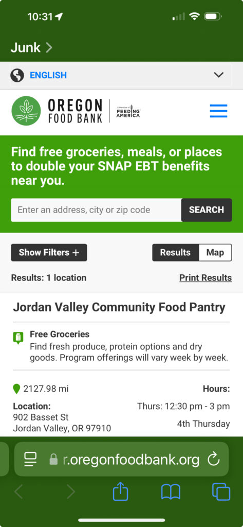
“…since most of the people viewing our map are looking at it from their phone that is the priority”
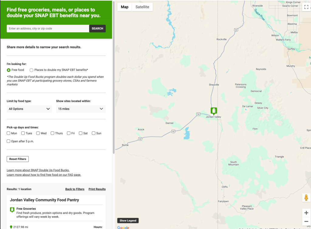
Our current map has several layout issues including cut off of the search bar and overflow of location information on mobile (examples attached.)
We would like the primary colors of the map to be:
Blue: HEX#005487
Orange: HEX#DE7C00
Oregon Food Bank : Mobile
Oregon Food Bank : Desktop
Requested by Feeding America San Diego (dwilliams_at_).